No display or test can establish that data were drawn from an exponential distribution. With real data you can be all but certain that they were not drawn from a simple distributional model like an exponential; real data don't accord themselves to such simple models (albeit this does not imply that such simple models cannot be very useful).
You might be able to sometimes conclude that the data are inconsistent with having come from an exponential, but not being able to establish that does not imply that they are exponential. Typically what you actually need to establish is whether the properties of something (given you treat the data as if they were from your model) are still acceptable to you. You should also be very cautious about the consequences for the properties of inference, prediction etc of using the same data to choose a model and to fit the model for that inference. Such 'data leakage' may be quite consequential.
Aside that important issue, while displays are typically more useful that tests when examining data to choose a model (in that they look at something more nearly related to the effect size that might be of interest), histograms have issues you should be aware of, which I discuss in some detail below.
I have seen a data set that looked quite consistent with an exponential in one histogram look close to symmetric in another (with different bin width and bin origin, either of which can impact the impression of shape). The issue is more likely to occur with few bins than many but the problem of fairly strongly differing impression based on two different histograms of the same data can occasionally occur even with relatively large samples.
My strong advice is to use other tools (I discuss Q-Q plots near the end of the answer), or if you must use histograms to approach them with a degree of caution about interpretation, at least until you have tried several combinations (more than one at least) of bin width and bin-origin. However, this at best deals with only half the question; it's not just how far from the exponential model the data might appear to be but also how the thing you want to use an exponential model to do responds to that particular form of non-exponentiality.
The difficulty with using histograms to infer shape
While histograms are often handy and mostly useful, they can be misleading. Their appearance can alter quite a lot with changes in the locations of the bin boundaries.
This problem has long been known*, though perhaps not as widely as it should be -- you rarely see it mentioned in elementary-level discussions (though there are exceptions).
* for example, Paul Rubin[1] put it this way: "it's well known that changing the endpoints in a histogram can significantly alter its appearance". .
I think it's an issue that should be more widely discussed when introducing histograms. I'll give some examples and discussion.
Why you should be wary of relying on a single histogram of a data set
Take a look at these four histograms:
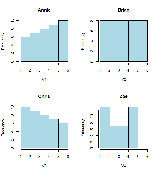
That's four very different looking histograms.
If you paste the following data in (I'm using R here):
Annie <- c(3.15,5.46,3.28,4.2,1.98,2.28,3.12,4.1,3.42,3.91,2.06,5.53,
5.19,2.39,1.88,3.43,5.51,2.54,3.64,4.33,4.85,5.56,1.89,4.84,5.74,3.22,
5.52,1.84,4.31,2.01,4.01,5.31,2.56,5.11,2.58,4.43,4.96,1.9,5.6,1.92)
Brian <- c(2.9, 5.21, 3.03, 3.95, 1.73, 2.03, 2.87, 3.85, 3.17, 3.66,
1.81, 5.28, 4.94, 2.14, 1.63, 3.18, 5.26, 2.29, 3.39, 4.08, 4.6,
5.31, 1.64, 4.59, 5.49, 2.97, 5.27, 1.59, 4.06, 1.76, 3.76, 5.06,
2.31, 4.86, 2.33, 4.18, 4.71, 1.65, 5.35, 1.67)
Chris <- c(2.65, 4.96, 2.78, 3.7, 1.48, 1.78, 2.62, 3.6, 2.92, 3.41, 1.56,
5.03, 4.69, 1.89, 1.38, 2.93, 5.01, 2.04, 3.14, 3.83, 4.35, 5.06,
1.39, 4.34, 5.24, 2.72, 5.02, 1.34, 3.81, 1.51, 3.51, 4.81, 2.06,
4.61, 2.08, 3.93, 4.46, 1.4, 5.1, 1.42)
Zoe <- c(2.4, 4.71, 2.53, 3.45, 1.23, 1.53, 2.37, 3.35, 2.67, 3.16,
1.31, 4.78, 4.44, 1.64, 1.13, 2.68, 4.76, 1.79, 2.89, 3.58, 4.1,
4.81, 1.14, 4.09, 4.99, 2.47, 4.77, 1.09, 3.56, 1.26, 3.26, 4.56,
1.81, 4.36, 1.83, 3.68, 4.21, 1.15, 4.85, 1.17)
Then you can generate them yourself:
opar<-par()
par(mfrow=c(2,2))
hist(Annie,breaks=1:6,main="Annie",xlab="V1",col="lightblue")
hist(Brian,breaks=1:6,main="Brian",xlab="V2",col="lightblue")
hist(Chris,breaks=1:6,main="Chris",xlab="V3",col="lightblue")
hist(Zoe,breaks=1:6,main="Zoe",xlab="V4",col="lightblue")
par(opar)
Now look at this strip chart:
x<-c(Annie,Brian,Chris,Zoe)
g<-rep(c('A','B','C','Z'),each=40)
stripchart(x~g,pch='|')
abline(v=(5:23)/4,col=8,lty=3)
abline(v=(2:5),col=6,lty=3)
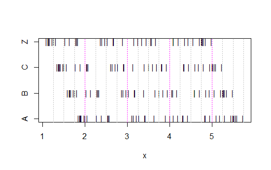
(If it's still not obvious, see what happens when you subtract Annie's data from each set: head(matrix(x-Annie,nrow=40)))
The data has simply been shifted left each time by 0.25.
Yet the impressions we get from the histograms - right skew, uniform, left skew and bimodal - were utterly different. Our impression was entirely governed by the location of the first bin-origin relative to the minimum.
So not just 'exponential' vs 'not-really-exponential' but 'right skew' vs 'left skew' or 'bimodal' vs 'uniform' just by moving where your bins start.
Edit: If you vary the binwidth, you can get stuff like this happen:
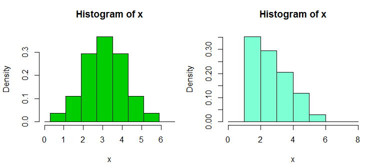
That's the same 34 observations in both cases, just different breakpoints, one with binwidth $1$ and the other with binwidth $0.8$.
x <- c(1.03, 1.24, 1.47, 1.52, 1.92, 1.93, 1.94, 1.95, 1.96, 1.97, 1.98,
  1.99, 2.72, 2.75, 2.78, 2.81, 2.84, 2.87, 2.9, 2.93, 2.96, 2.99, 3.6,
  3.64, 3.66, 3.72, 3.77, 3.88, 3.91, 4.14, 4.54, 4.77, 4.81, 5.62)
hist(x,breaks=seq(0.3,6.7,by=0.8),xlim=c(0,6.7),col="green3",freq=FALSE)
hist(x,breaks=0:8,col="aquamarine",freq=FALSE)
Nifty, eh?
Yes, those data were deliberately generated to do that... but the lesson is clear - what you think you see in a histogram may not be a particularly accurate impression of the data.
What can we do?
Histograms are widely used, frequently convenient to obtain and sometimes expected. What can we do to avoid or mitigate such problems?
As Nick Cox points out in a comment to a related question: The rule of thumb always should be that details robust to variations in bin width and bin origin are likely to be genuine; details fragile to such are likely to be spurious or trivial.
At the least, you should always do histograms at several different binwidths or bin-origins, or preferably both.
Alternatively, check a kernel density estimate at not-too-wide a bandwidth.
One other approach that reduces the arbitrariness of histograms is averaged shifted histograms,
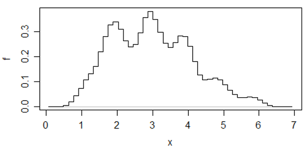
(that's one on that most recent set of data) but if you go to that effort, I think you might as well use a kernel density estimate.
If I am doing a histogram (I use them in spite of being acutely aware of the issue), I almost always prefer to use considerably more bins than typical program defaults tend to give and very often I like to do several histograms with varying bin width (and, occasionally, origin). If they're reasonably consistent in impression, you're not likely to have this problem, and if they're not consistent, you know to look more carefully, perhaps try a kernel density estimate, an empirical CDF, a Q-Q plot or something similar.
If you want to use a display to assess some distributional model, I most
often tend to think about some form of Q-Q plot. For the exponential, the 'ordinary' Q-Q plot would plot the ordered data against $-\log(1-p_i)$ where as usual with Q-Q plots $p_i$ is chosen so that $F^{-1}(p_i)$ gives a good approximation of the expected order statistics of a standard member of the distribution, in this case of an Exponential(1) – e.g. in R you might do something like plot(qexp(ppoints(y)),y[order(y)]). While a more accurate asymmetric Blom-type approximation ($p_i = \frac{i-a}{n+1-a-b}$) for the expected order statistics is not at all hard to come up with in this case (the asymptotic values $a=0$ and $b=\frac12$ work well even at small $n$), and even exact expected order statistics are not difficult to compute, the default symmetric approximation from ppoints seems to do quite okay as it is. However, for interpreting the plot, the longer upper tail in the exponential results in a typically 'noisy' plot that tends to vary a lot at the top right (making it hard to judge how much deviation from straight is reasonable), so for ordinary ($0$-origin) exponential models in particular, I tend to take the cube root of both axes instead which then tends to behave much more like a Gaussian Q-Q plot, something which I have had plenty of practice with and find relatively easy to interpret.
While histograms may sometimes be misleading, boxplots are even more prone to such problems; with a boxplot you don't even have the ability to say "use more bins". See the four very different data sets in this post, all with identical, symmetric boxplots, even though one of the data sets is quite skew.
[1]: Rubin, Paul (2014) "Histogram Abuse!",
Blog post, OR in an OB world, Jan 23 2014
link ... (alternate link)