I've been a big fan of Ovo Energy since switching to them last year. They email me a PDF statement, pay me 3% interest on any overpayments, and have their call centre waiting times displayed prominently on their homepage.
So, when they announced their new app, I was expecting something a little bit special. And that's exactly what I've got.
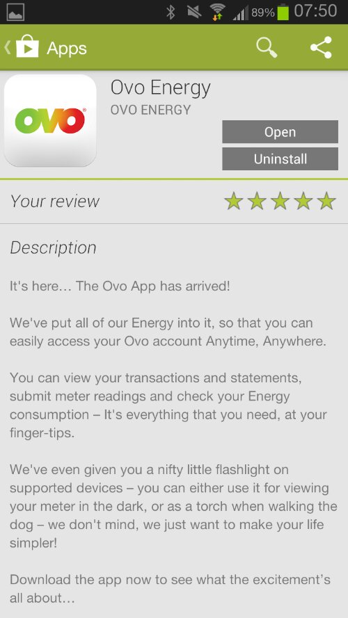
An automatic torch to help you when you're rooting around in dark cupboards trying to read your meter. Brilliant.
So, not only does the app fulfil its main purpose (submit gas & electricity meter readings, see my bill, etc), someone has obviously taken the time to see how the app works in the real world. Sure, there are plenty of standalone torch apps in the world - but this is the first time I've seen one so thoughtfully integrated into an app.
Ultimately, this app is probably going to be used once per month. It needs to be simple enough to use that the customer doesn't have to relearn how to operate it every time. More than that - it needs to be delightful to use.
As much as we would all love our users to open our app several times a day, the reality is that they won't. That's why we need to concentrate not on beauty, not on overall UX, but on tiny moments of joy which reminds people why they should keep our app on their phone and keep coming back to it.