Flying out of Boise, Idaho you don’t have a lot of options. There are only direct flights to a few cities and every itinerary has its downsides. Because of that I spend a lot of time using United’s advanced flight search.
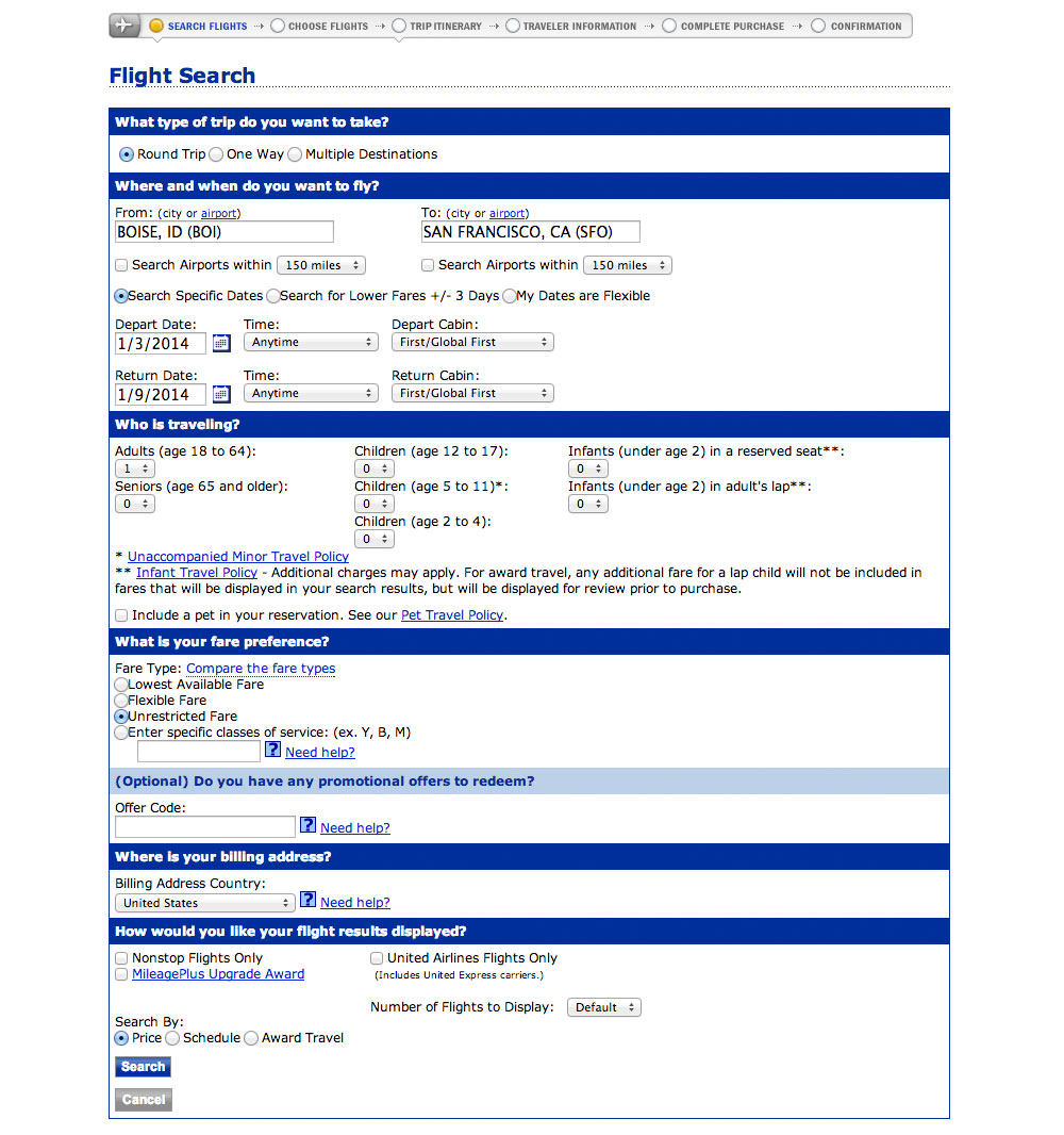
I had two goals in redesigning this screen:
- To know how it could look and function.
- To teach designers how to use Photoshop.
In this post I’ve got a two-part video walking you through the redesign. These videos are the first half of the entire case study available in my upcoming course, Photoshop for Interface Design.
The videos
Part 1
Part 2
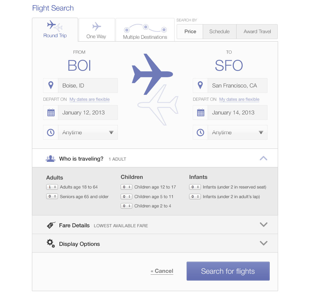
The finished redesign
These videos take you halfway through the case study. The next two are coming next week. To make sure you get those sign up for the email list at the end of this page.
In the mean time, here’s what the final design looks like:
Ready to learn more?
Photoshop for Interface Design is my new course on using Photoshop to design great software. Whether iOS apps, websites, or complex SaaS applications, I’ll teach you the techniques used by professional designers. You can skip right past the Photoshop tutorials for photographers (no red-eye removal tutorials here) and go right to learning about paths, layer styles, and the techniques you’ll use every day.
If you want to learn to use Photoshop—and value your time—this course is for you.
Sign up with the form below to hear more about the course and also get the next installment of this case study.