The Other Linux Logo
ecogex.comThe small eyes version is freaky for such a logo. With Big eyes it looks friendlier, but still not cute...
For something neutral and scalable, having a side perspective could perhaps work better ? Like this one for instance, with very few lines yet looks good.
https://encrypted-tbn0.gstatic.com/images?q=tbn:ANd9GcRMINEP...
Yeah, the front perspective evokes associations with a predator locked on its prey.
The Small Eyes + Standing + GNU Chimera version is straight up a demon doll which could feature in the Twilight Zone.
Yet its expressionlessness captures the lobotomized drone-like corporate flair that characterizes mainstream Linux today.
I'm not against it as long as we don't erase Tux from older projects.
Not unlike one of the Penguin Books logos.
https://i.ibb.co/srBgHt0/7db42060b910d2a81ae18b0fd807947a.jp...
I had the exact same thought. I wish the eyes were bigger, it looks scary.
the way the big eyes are drawn it looks scared, the way the small eyes are drawn it looks sinister
I feel bad to be this critical but it fails in direct, context free recognizability.
It fails to evoke "penguin".
I wouldn't have recognized it as a penguin without context, and I doubt others would without priming.
I think it would work quite well in an icon/emoji setting, where the context "operation system brand" was already established.
E.g. think of some "coose your OS" widget with entries:
- (Apple with bite) MacOS - (Colored flag) Windows - (This icon) LinuxI disagree while, there is an Linux icon that would fit in here. This is not it. It might be a starting point, I don't think the design works. despite how simple the windows and apple logos they represent thousands of hours of work by the best graphic artists.
I'm not one of the best graphic artists but I'll give it a shot. First the default version feels vaguely ominous. To me it feels like someone robbing a bank or the logo on stormtroopers murdering civilians, this is obviously horrible. I think this is due to the sharp angles and the eyes without an attached mouth.
The other options improve the scary problem but add complexity that moves it away from the simple universal recognizable logo we are trying to make. On that note the default version is still too complex. Maybe you could move to more of a silhouette, though I think that would fail in recognizably.
Perhaps part of the problem is a penguin is just not so omnipresent in our lives as windows and apples are. Redhat does achieve this with a very simple instantly recognizable logo, I think that could work. Ubuntu also does well with it's logo thought it has gone full abstract, it's distinct and works well.
If you want to see more google image search for "logos"
You want a dev to fill in that third set of bracket with "A penguin", and it didn't happen.
Tux evokes "earless chimpanzee with duck feet" for me, anyway.
Or swimming fins maybe since they're enormous.
My first thought was a Russian doll.
The "seated" option adds the feet and helps make it more recognizable.
looks like a bottle top opener to me, in fact i think it would work just fine as one.
This is great. I made a download button a while ago. The Apple and Windows logos scale down, look great, and are easily identifiable. Tux is great, but just doesn't scale down. Tried about 10 variants to get one that is recognizable, but also works at smaller sizes.
Many attempts at this from many people: https://www.svgrepo.com/vectors/linux/
In the list you shared, my preference would be https://www.svgrepo.com/svg/50402/linux
So much better than op. It's cuter and more recognisable while being simple for good scalability. Perfect.
I failed the 'vercel security check point' with my browser. It sucks if you only can browse the web with chrome based browsers..
Just tried from Firefox and can confirm, it blocks the page load.
FYI using FF Nightly, no issues.
It is for your security. Next they will implement age verification. Linux is not for children. /s
i've seen people use emojis and i think it makes sense: just use an apple, window, and penguin emoji, and the platform will usually display something reasonable at ~all scales
Comparing this logo to the original reminds me the whole discussion about skeuomorphism (that's when GUI icons imitate closely things from the real world).
Icons that strongly resemble things from real life are, quite often, problematic at representation, especially in smaller sizes. They take more time to understand and decode, they're prone to confusion.
But anti-skeuomorphic icons also have a problem of their own: they become so abstract that quite often we don't know what they represent. They become cold and soulless, like corporation logos. An example: I look at this new icon and what I see is Darth Vader with an open big mouth.
It is like comparing IKEA furniture and Bauhaus or Scandinavian design against Art-Noveau or Antonio Gaudí's architecture. The first are (as Nietzsche would say) apolinean, elegant, subdued and functional. The second are dionisiac, fun, a feast for the senses.
Skeumorphism isn't just resembling things from the real world. It's using simulated physical object styling and detail in a user interface to signify affordances in the design.
A penguin icon is not a skeumorphism because it being a penguin doesn't tell us anything about how to use the icon.
If the icon were a rendering of a physical push-button, then it would be skeumorphic, because the button image would suggest to us that we can click it.
Unless you're trying to make the argument that penguins deserve boops on their beaks.
I am not sure the term is so strict and applies only to "controls" in GUIs.
Case in point: the Wikipedia page on skeuomorphism refers to objects outside of the domain of GUI language. It also covers physical objects referencing other physical objects (e.g.: skeuomorphic pottery, wood architecture imitating stone, plastic objects imitating metal, etc.)
Yes, but we're talking about digital interfaces right now.
Even when considering faux finishes on real world materials, that standard doesn't apply here. Unlike, say, the wooden shingles cut to look like stone on Colonial era architecture (e.g. George Washington's home at Mt. Vernon) that are trying to convince us they are something they aren't, the penguin icon is not trying to, nor would it ever, convince us it's a real penguin.
Going back to my first sentence, yes, skeuomorphism is a concept older than computer interfaces. When the term is applied to computer interfaces, it has to be adapted. Since current display tech could never create something even close to a convincing simulacrum of, say, a notebook, the term then gets adapted to mean that the use of skeuomorphism attempts to communicate functionally. Much like how "brutalist" Web design has nothing to do with the Brutalist architecture movement.
I cannot unsee Dark Vader now :0
Basking shark vader.
I think the word you're looking for is more like avant-garde movement, cubism, surrealism, communist constructivism, post-modern deconstructivism, postmodernism, or something towards that rough general direction towards the MoMA and the Guggenheim museum, rather than skeuomorphism/anti-skeuomorphism dichotomy.
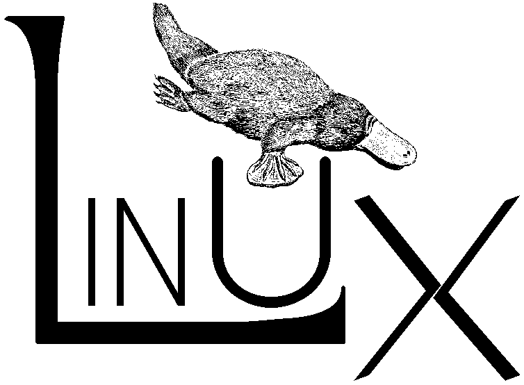
I thought this would be about the other Linux logo, that preceeded the penguin:
Do you have more information about it? By googling "Linux platypus" the only thing that I could find is that exact URL
The Tux penguin was suggested as the unofficial logo for the 2.0 release of Linux, which had SMP support and was a big deal. It half-jokingly received Linus' blessing and everyone has used it since.
It's easy to see why, it is an instant classic, very cute, and works in different situations and at different scales. Larry Ewing who drew the picture, a sysadmin and not a professional illustrator, still has a web page up describing it: https://isc.tamu.edu/~lewing/linux/
Before that there were many logos but the platypus one was probably the most used. Walnut Creek, who put out CDROMs with shareware and freeware, used to publish the popular Linux distributions too and they needed something for their covers and used it.
Slackware kept using it for a long time. I believe the idea was that Linux, too, looks like it was put together by disparate parts. Web pages back in 1996 was mostly textual and pictures were used sparingly so the use case was mostly books and CDROM covers. There is a certain cuteness to it and it did look good on T-shirts.
Slackware used J.R. "Bob" Dobbs / Dobbshead from the Church Of The Subgenius as an "unofficial" mascot/logo until the S became it's defacto logo. The Dobbshead still shows up.
If you google for slackware 96 cd youll find a similar one. :)
I thought this was going to be the fox one https://xenia.efi.pages.gay/
I was always partial to the Linux logo with the red triangle (from 1994): <https://www.ibiblio.org/pub/Linux/logos/raytraced/linux-povl...>.
(More old Linux logos here: <https://www.ibiblio.org/pub/Linux/logos/!INDEX.html>)
Thanks for the link.
This is my favorite from it. :-D https://www.ibiblio.org/pub/Linux/logos/weblogos/itworks.gif
That's a nazi concentration camp badge of shame, I think?
https://en.wikipedia.org/wiki/Nazi_concentration_camp_badge
"Political prisoner", in fact.
You're attributing too much
It's just a logo that's built around single triangle. It's like saying ACDC band promotes nazi ideology because it has a lightning symbol and gothic looking letters in their logo
It's clear these Linux logos weren't done by professionals and by some examples not even with serious usage intent
Compare above to:
https://meta.wikimedia.org/wiki/Logo_suggestions?useskin=vec...
https://meta.wikimedia.org/wiki/International_logo_contest/F...
https://meta.wikimedia.org/wiki/International_logo_contest/O...
https://www.without-systemd.org/wiki/index_php/Category_Logo...
https://pkgbuild.com/%7Ejelle/logo-contest/
Let me be harsh and say: some people know how to design and some shouldn't touch graphic programs
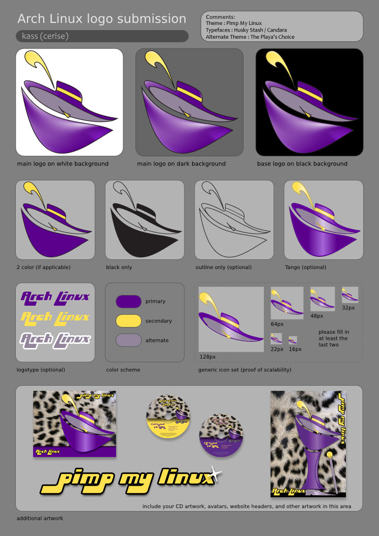
Most of the Arch Linux proposed logos are some dreary variation on the letter A. The pimp hat proposal is more meaningful.
https://pkgbuild.com/~jelle/logo-contest/cerise/2-pimp.png
I also like Skeletor but he is unfortunately © Mattel.
If anything, this would be point in its favor. That is, if we are to care whatsoever about nazi rules from a century ago.
That's just how a lot of logos in the 90s looked, some colorful polygons, shadows, 3D effects...
It looks like a haunted platypus.
Looks like a bottle opener to me.
BTW Tux is the linux mascot, not logo
The other logo is a fox: https://knowyourmeme.com/memes/xenia-linuxfox
Kinda wish that one had won, foxes are cooler looking and more marketable.
Foxes are also overused and I consider myself fortunate in not having come across Tux-the-penguin with a 'trans flag' - follow the link if you wonder what I mean - nor do I rue the absence of any furry-like characteristics in the toy penguin. This furry fox seems to be just that, a generic anime-like furry avatar, one out of thousands and as such not memorable.
A random person's drawing does not become a logo for a well-known project by merely existing.
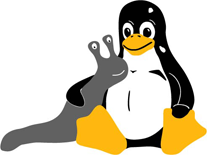
I thought this was going to be a post about Tuz, the tasmanian devil wit a penguin mask: https://en.m.wikipedia.org/wiki/Tux_(mascot)#Tuz_2009
It's a nice minimalist design, but I think it still doesn't scale down as well as the Apple and Windows logos. The logo needs to be simple yet more expressive somehow, perhaps only focusing on Tux's head?
I thought this was going to be about the pre-Tux platypus: https://www.ibiblio.org/pub/Linux/logos/platypus/!INDEX.html
Don’t fix it if it ain’t broken!
On the topic of Linux logos, about 20 years ago there was a popular Ethernet <-> USB storage bridge called an NSLU2 aka the “Slug”. It was of a similar pedigree to the classic WRT54g but instead of routing, this device turned cheap USB disks into a NAS device:
https://en.m.wikipedia.org/wiki/NSLU2
There was quite an active group of hackers bringing Linux to the platform. This was their utterly heartwarming and adorable logo:
https://www.socallinuxexpo.org/scale8x/sites/socallinuxexpo....
Love the direction. But small eyes looks spooky and big eyes looks terrified.
Thought this was about Xenia for a moment... :)
It looks like he's wearing a mask
Reminds me a little bit of Shamshel's head from NGE
And whoever is behind this site, also has idea for "Universal Bitcoin Logo Alternative": https://news.ycombinator.com/item?id=5451084
Meh, not for me. It's like someone saw the iconic Linux logo and said "what if this was done by an overfunded pre-revenue Silicon Valley startup instead".
Does Linux really have a logo, or just a mascot? Does Linux even need a logo if every distro has one? Do logos even make sense anymore?
I am sorry to say this, but this one looks soulless to me.
Can we bring this https://commons.wikimedia.org/wiki/File:Crystal128-penguin.s... version back instead? I hear Apple has decreed that glossy/glassy design is cool again.
I'm a fan of the 2nd revision myself, it's sooo Web 2.0
https://seeklogo.com/vector-logo/492036/linux-tux
But the OG Tux remains undefeated I'm afraid
That's the one (besides OG Tux) I liked most. Though the "glassy" original Tux wasn't bad at all.
Testament to it's appeal is when it's used by businesses to promote their ice creams/slushies.
There were times when Crystal was even "ported" as Windows visual theme and later as package that swapped resource files: https://archive.org/details/crystal-xp-3.0
Wow what a flashback! I think I used to use this back in the day.
I had tons of these "visual styles" and I remember how MS liked to patch themeui.dll and uxtheme.dll often rendering theming broken.
There were also attempts at customizing XP booting screen to achieve the perfect "it's not Windows" effect but that could easily render installation unbootable
That... Brings back memories
Stroke Tux
Clearly modules were broken and kernel couldn't be build
It looks a bit better with Tux's face: https://pmarks.net/posted_links/tux-weeble.png
Uh, it kinda brings me memories of "Ugandan Knuckles" meme
lol. That looks like some haunted playground toy found in a backrooms level. The eyes follow wherever you go!
It’s all good though. Most of the “Linux logos” don’t look very good to be honest.
Couldn't quit put my finger on it, but soulless might be it. Doesn't capture Tux's personality.
There are some buttons to change the details. I like the "big-eyes" and "sitting" version.
GNU chimera version speaks to me
I don't think Tux is perfect by any means, but that was my first impression too. It's the eyes. They look dead inside.
It has the corporate letterhead vibe. I guess for some that is a feature.
It looks like a Hollow Knight character.
To me it looks a bit creepy enlarged, but it works really well in small size, (which was the point)!
Totoro Ghost
The beady eyes & shape feel a bit too Android-y to me
This is absurd. I literally spent 30 seconds with the image on GIMP, making just few warps and it's markedly better. I don't mean to make a pull request or anything and I still don't exactly like/love it, but my point is, the original clearly was built on solid artistic basis and yet they published the alien head. What was the author thinking?
1: http://numpad0.com/imgs/2025-09-28%20002632.png
e: I think by far the biggest problem is completely circular eyes. Just replacing it with ovals solve minimum half of the problem. Then the head can be enlarged for better feeling of attachment. The beak can be sharper too. But those are less problematic than the eyes. Even just removing them altogether helps.
Nobody says anything about the tasmanin one. :)
Reminds me of the Groke from Moomin
It looks appropriate for Halloween.
I do not support this logo.
Meh. Looks like a boring robot (pretty much a clone of the Android logo), the cute penguin is much better even when it looks old school by now.
I've also made "The Other Ecogex Logo", looking something like this: https://www.istockphoto.com/photos/poo-emoji
Free to use as you please.
Looks too much like another emoji.
> The Other Linux Logo
... shows the bloat from the head.