Death by PowerPoint: the slide that killed seven people (2019)
mcdreeamiemusings.comLinked from Tufte’s article, I found this interesting comment from someone’s experience at Microsoft: [1]
> Attempting to have slides serve both as projected visuals and as stand-alone handouts makes for bad visuals and bad documentation. Yet, this is a typical, acceptable approach. PowerPoint (or Keynote) is a tool for displaying visual information, information that helps you tell your story, make your case, or prove your point. PowerPoint is a terrible tool for making written documents, that's what word processors are for.
I think that’s on point for many companies. A lot of the terrible slides you see in meetings are actually intended as documentation after the fact, and few people recognize (or care) that this makes for a terrible presentation.
Ironically, I think Powerpoint isn’t such a bad tool for creating handouts. If the intended reader reads the document on their screen instead of printing it, a nice PDF with screen-shaped pages might actually be close to optimal.
You just have to be 100% clear whether you’re creating a document or a presentation.
[1] http://mamamusings.net/archives/2005/11/19/the_culture_of_th...
I don't know. Over time, I've learned to appreciate the kind of slides physicists make, which follow all the "worst practices". They are very dense, with lots of plots and text. They are like, I imagine in the olden days, when people would draw things on blackboards or print out their plots, and sit around them and interpret them. They are the material, and what the presenter does is walking the audience through the material. Compared with a scientific paper, they lack all the prose and weird formal phrases that make papers hard to read. You basically just show what your colleagues need to work with, not less or more. Most importantly, you are not trying to persuade anybody.
My experience outside of academia is that people use PowerPoint exactly for persuasion. Even to the degree that when I wanted to prepare a presentation internally, one of my bosses got angry because he thought I was going to bullshit him. (PowerPoint is something you do to a customer or to the board, not to your colleagues.)
Your boss must have been traumatized by some salesman.
PPTs are great, when they have been written by someone who knows what to communicate and how to do it, which involves knowing your audience. For boffins, slides that are denser than average but lighter than what they would otherwise have to read, are just fine. For the layman, one better err on the side of simplicity and direct impact.
> PowerPoint is something you do to a customer or to the board, not to your colleagues
That is bullshit borne of insecurity. If one can be persuaded so radically by a presentation, one's convictions are pretty weak to begin with.
I've been taught that if you are selling high tech products to C-levels at the biggest companies you want to have highly information dense slides (e.g. condense 2 slides into 1, then condense 2 of those slides in 1) but also have them well organized so you can make a presentation that drives home a few key points.
Personally I am a big fan of powerpoint for making "boxes and lines" diagrams about how a product works, what process we're using, things like that. I love making stuff like
https://www.slideshare.net/paulahoule/making-the-semantic-we...
> at the biggest companies you want to have highly information dense slides
One of my bosses got that memo - the whole thing is one single giant slide with 12 indicators or so. Their sessions are hell, they make people roll eyes and disengage out of boredom. The message I get is that they either don't really care to interact with us hoi polloi, or are just bypassing their own inadequacy at managing a deck at speed - which is understandable, but at that point why are you even there?
IMHO, if one has 6-9 segregated boxes on the same slide and is going to describe each one, they could have been 6-9 slides with exactly the same content but bigger and more impactful. But people have grown to fear the whitespace (can't help themselves overfilling each slide) and transitions (the dreaded pause and meaningless "let's read the title" which is horribly endemic in the States), so they go for this compromise. The impatient reads the whole slide and tunes out, but is not annoyed at you for keeping him from doing that, so it's considered a win. Still, he's not listening to anything you're saying - you could have as well just sent an email.
(It might well be just a fad. C-levels love fads like your next person. In fact, they often love creating fads, just to watch the monkey dance.)
IMHO, a slide should have the elements you're linking together to make a single point. If the point is "sales are good but margin is bad", you'll need a few graphs in the same slide, for sure. But you need transitions at some point to keep people awake and focused on the train of thought you want them to ride. Even in a TED talk, where you really just want people to look at you and only you, the occasional flash of light from transitions is necessary to keep the senses engaged.
>My experience outside of academia is that people use PowerPoint exactly for persuasion.
It happens in my corner of academia too, and I'm all for it. When I give a talk, I'm trying to persuade people to read my paper and ask me interesting questions about the work. The paper has all the gory details. The point of my talk isn't to duplcate the written text, but to make it accessible enough that people want to learn more.
100%. One of the things I'm drilling into my team (we do a lot of slides!), is you have to decide - are you making slides for:
1. presentation - should be sparse, key, anchoring data that enables people to ground themselves while they listen and pay attention to YOU
or
2. Reference - dashboard and background and details and density
If a deck may be used for both purposes, intentionally or not (e.g. we expect it to be shared and referred to by people not attending), resist the urge to do a hybrid slide, and if at all possible make presentation slides at front, reference/supplementary slides at back.
Worst situation is when somebody uses what are effectively reference slides for a live presentation. People's attention is split between reading and making sense of dense information on screen, and the key important points you are trying to verbalize.
"resist the urge to do a hybrid slide, and if at all possible make presentation slides at front, reference/supplementary slides at back."
This has been my SOP for years, but its amazing how resistant some folks are to it (like $NUMBER_OF_SLIDES is the sole measure of quality...with "more slides are bad, mmmkay" being the default). I fought with my last boss on this endlessly, as I would rather have many slides with small digestible chunks of info that I could scaffold my presentations through at a brisk clip, and they preferred as few slides as possible, with dense text and charts, that they would elaborate on in long exposition.
I always got better positive feedback, to no avail. My decks would be 'edited' into a compacted slop-fest. Drove me batty.
One effective way of juggling the two types of slides I've found is to stick the reference slides into an appendix that isn't part of the actual presentation - but can be quickly pulled up during ensuing discussions, and for the benefit of people reviewing the slides later.
High-level stats during the actual presentation, meaty details available upon request.
Most slide decks I ever see I see long after they are presented. As a result I want slide decks to stand alone -- that or else video to be published instead of slide decks.
As a presenter I have to worry about whether my slides will be seen w/ or without video of my presentation. Therefore I try to make my slide decks able to stand alone, though I admit this is not great.
The common pattern now instead is to make colorful and near-content-free slide decks where the presenter simply speaks with colorful backgrounds. I am terrible at crafting such slide decks -- well, I've not tried. This pattern works while presenting though, and I should probably adopt it. Or perhaps I should adopt the Jeff Bezos approach.
What presenters and audiences need is a commitment to publish video of presentations, including Q&A segments. And video has to be playable at 2x speed.
(Yes, almost every video I watch I watch at 2x speed. Where platforms allow faster playback speeds I've even gone faster. Speech is extremely low-bandwidth. This does mean I've to backtrack more often than I'd like, but it's still better this way. I pay attention more when speech is faster -- up to the point where I can't follow, of course, and which I shy away from.)
>Most slide decks I ever see I see long after they are presented. As a result I want slide decks to stand alone -- that or else video to be published instead of slide decks.
I use presenter notes precisely for what you're describing. My actual slides are sparse, but I distribute slides with full presenter notes so all the main points get across in a written form after the fact, without distracting from the talk.
In Powerpoint, I use the "print to PDF" function and tell it to generate pages containing slides with notes.
Yeah, this is a good idea.
I'd add a tip: start writing your notes in the speaker notes and leave the slides blank, instead of the other way around (which is kind of what PowerPoint's UI pushes you towards). Only create the actual slide content after refining your speaker notes once or twice.
For me, at least, I find it's much easier to add content to the blank slide than it is to refine (aka: erase words from) the sentences I initially type out. I tend to like slide content that is graphics (photos, screenshots, graphs, diagrams), titles, or lists of short headline-style text (1~3 words).
> start writing your notes in the speaker notes and leave the slides blank, instead of the other way around (which is kind of what PowerPoint's UI pushes you towards). Only create the actual slide content after refining your speaker notes once or twice.
At that point, you might as well extract those notes into a proper technical report—which is the _actual_ conclusion that Tufte came to:
> Attempting to have slides serve both as projected visuals and as stand-alone handouts makes for bad visuals and bad documentation. Yet, this is a typical, acceptable approach. PowerPoint (or Keynote) is a tool for displaying visual information, information that helps you tell your story, make your case, or prove your point. PowerPoint is a terrible tool for making written documents, that's what word processors are for.
(Aside: Did anyone actually click through and read Tufte's original "PowerPoint Does Rocket Science" (that this piece borrows liberally from—and then perverts)? This piece amounts to middling-quality reblog spam, except worse—because it comes with the added downside that it injects some synthesis about the slide in question (containing "a huge amount of text") being described as too long. Anyone following up and checking sources will see that not only is this not supported by Tufte's work, but it wouldn't be a stretch to say that what is presented here as a summary of the work of Tuft et al runs counter to what they had to say.
It gets truly bizarre when you start reviewing the samples that Tufte provided. It turns out that the slide pictured in this article is not even the slide that was "in play" during the relevant incident. If this blog post were a serious publication (instead of a grey area, slightly scummy, content-marketing afterthought that it is), it would constitute academic fraud...)
Nice, I like that!
There is a great example of this from the fine folks at ITA Software (now Google Flights). Their founder wrote basically a paper on the challenges of writing airline ticket optimization software…in PowerPoint. The slides are thin on information but the speaker notes explain everything.
Since seeing that, I double-down on making my speaker notes tell the story for those that couldn’t be in the room.
Presenter notes though are intended to help the presenter, and their form is not great for users who missed the presentation. As well, the presenter often does need presenter notes that are terse and not suitable for the public. We need slides that are shown at the presentation, slides not shown at the presentation but which are public, and presenter notes.
I think that's the presenter's responsibility. I use the presenter notes to organize my thoughts. By the time I give a talk, I already have most things memorized and only need to grab a few phrases here and there from my (rather detailed full-sentence) notes. The notes easily stand on their own.
It's certainly an improvement over the usual ineffective way people make slides and give talks: by reading bullet points off the slides themselves. I keep over 90% of the text for my talks in the presenter notes. It's equally useful for prepration and for future reference.
Video is of course not necessary, just sufficient.
What you want are the talk notes, something you can read to understand what the shape of the talk was, what context each image came out in. The video of the actual talk substitutes quite nicely for these notes.
It would be preferable if more presentation media had a “front of card/back of card” approach where the card itself specifies how long it thinks it should be on the screen (evaluable over “timing runs”), bullet points for the speaker and readers of the printed form, as well as the image that will be shown.
> Video is of course not necessary, just sufficient.
It should be so, but that means writing different materials, one for the actual presentation, and one for everyone who couldn't be there. It would be better to have the video.
Mind you, for accessibility and general user-friendliness, you want both. But audio/video is a great help because there will be things that the off-line materials miss.
> It would be preferable if more presentation media had a “front of card/back of card”
Yes. PowerPoint and the like generally have a public / presenter distinction, but we want three distinctions: online / off-line / presenter.
I work in the medical field and my brain cells have been constantly assassinated for years by bad presentations. Every once in a while I find unicorns - people who tell a story, teach and present using Powerpoint/Keynote slides as support - conveying information that is hard to put into words -> a photograph, an animation, some simple flowcharts to refer back to whilst talking about what is really the subject of the matter.
I've seen Powerpoint since medical school evolve from trying to squeeze as much information as possible on slides to utter nonsense and hundreds of words per displayed page. Heck, just stay home and automate your presentation to display the slides and mail them to your students instead, don't do this.
I've also been guilty when having to turbo half ass wing a teaching session of stuffing a lot of text in my slides. But I was aware this was not appropriate and I always tried to not be "that person". However, when you have 30 million presentations per day around the world, this is almost impossible to do.
This. I remember the day when I casually asked my cofounder, an amazing storyteller, how his day was.
He answered: „Awesome. I had 8 slides this morning. Now I have three.“
That day, something fundamentally clicked in me.
I learned that day that condensing and sharpening information towards a punchline is real, hard and meaningful work.
Or, as Mark Twain once said, “I didn’t have time to write you a short letter, so I wrote you a long one.”
It was Blaise Pascal in his Lettres Provinciales.
For an in depth review of the phrase: https://quoteinvestigator.com/2012/04/28/shorter-letter/
I am partial to Woodrow Wilsons' variation on the theme; something resonates when I'm asked to for a development/programming estimate.
Powerpoint even has a special mode for creating handouts, by printing a non-displayed notes section. There's no need to put the outline on the slides... other than being less effort.
What's are "screen-shaped pages"? My screens are all kinds of ratios and orientations.
I wish pdf would die. It's a left over vestage of a paper world. It's also left over from a non-connected, non-international world A4 vs US Letter.
PDF really has no place in this smartphone first world
Pdfs are terrible for letter style docs on phones (reflowable text is better, say in emails), but they are great as slides. Certainly easier to distribute or display than proprietary PPT editors.
Reflowable text is fine for conveying information on a tiny screen, but that’s about it.
When your screen is bigger than a page, reflowing the text is almost never what you want because long lines are hard to read. Thus even though computer screens aren’t limited to the size of a sheet of paper, you want to wrap your lines at paper-width (or better, book width) anyway.
Note that programmers typically define an effective page width for source code by enforcing an 80-100 column limit.
> PDF really has no place in this smartphone first world
:shivers:
Makes me think of being forced to dig a hole with tweezers.
"a nice PDF with screen-shaped pages"
Right, but you can create such a thing with a word processor. Just change the page size or orientation.
Sure, the page breaks might not default to where you want them, but you can add page breaks wherever you want, and don't need to create a text box for each paragraph.
More importantly (to me anyway), copying large swaths of text is so much more reliable in a word doc. Copying text in a pdf (derived from PowerPoint no less) is a special hell.
Unbelievable, I've never copied text from a PDF without some error. It's baffling how broken that system is compared to say, text selection in web browsers.
If you start doing fancy CSS tricks you can break that too, of course.
In a PDF, every single glyph could be independently positioned. Most aren’t quite that pathological, but frequently every text run is independent.
A PDF can contain metadata that correctly sequences the characters which is great for cut-n-paste, accessibility and reflowing the text. That metadata is frequently absent and the mechanism for incorporating it is by no means simple.
Another NASA screw-up that they're trying to pin on the vendor engineers, just like Challenger.
The title is not reassuring. Conservatism in engineering is essentially about creating safety margins through conservative estimation. The title is saying we need to be careful because a tile was likely penetrated. Hell, if I remember correctly they were reporting that there was known tile damage on the news before reentry, but that they didn't know the extent.
"NASA felt the engineers didn’t know what would happen but that all data pointed to there not being enough damage to put the lives of the crew in danger."
If you thought they didn't know, then ask them what they do know! It's right on the slide that flight conditions are outside of test parameters and that the mass of the projectile was much higher. How the F do you work at NASA and not understand the basic principles of mass, velocity, and energy well enough for that to stand out enough to ask questions or run your own calculations...
The reason the slide is laid out the way it is, is because it's describing the thought process and creates a deductive argument for how they got to their concern. This is a presentation for a briefing for other engineers, not a conference or sales pitch. It's supposed to be formal and contain the synopsis of technical points. Using projectors for technical briefings predates the use of PowerPoint. I see nothing wrong with the layout in that context.
Edit: why downvote without a reply? NASA has a history of blaming vendors when they screw up. This looks like another example to me. The presentation format does not have any issues given the setting and target audience.
Tufte is not an employee of NASA. He is an employee of Yale, and a thought leader in information design. HE was the one saying the slide design is poor, and doing so not in the interest of assigning blame, but in the interest of highlighting ways to communicate better.
To say that "the slide doesn't have any issues" is laughable on the face of it. But it's immaterial; your claim is that "NASA just ignored the engineers from Boeing" rather than "NASA didn't understand the engineers from Boeing". Communication is a two party process, and believe it or not, NASA isn't actually incentivized to take risks that lead to loss of life and damages public perception of them; it's far more likely they didn't understand the stakes, and looking at the slide from that perspective, it's very easy to see why they would not have understood the stakes even if the Boeing engineers did.
I understand that he's not a NASA employee. Do you think it's fair to claim that the slide killed 7 people? I don't. Could it be worded better or have a better layout - sure. But there's no problem with that slide that would support the claim that 7 people died because of it. The information was there.
As you said, it is a 2 way street. Slides are accessories. Do you have the conversation that unfolded during this slide and presentation? Did the audience ask questions about things they didn't understand?
Is there even any evidence that NASA didn't know about the damage or had a rescue plan?
You claim they wouldn't have taken the risk, yet if I remember correctly they had no rescue plan and gave a relatively low (70%ish maybe) survival rate. Low level employees did raise concerns about severity of the damage. This seems to support the idea rather the communication between the vendor and NASA was sufficient since some NASA employees shared the same view.
https://www.dailymail.co.uk/news/article-2271525/It-better-d...
There was serious consideration to sending Atlantis as a rescue mission as Columbia was not in a position capable of rendezvousing with the ISS to use the later as a lifeboat. To your point, subsequent missions were required to have a formal rescue mission outlined.
Agree. Also where is the executive summary for that slide on that slide?
> Also where is the executive summary for that slide on that slide?
Q: Shouldn't every PowerPoint slide be an executive summary? PowerPoint can be a terrible way to [attempt to] present detail.
I believe they were using that question to point out the absurdity of making a slide that long by suggesting that it is made even longer with a summary of itself.
> The title is saying we need to be careful because a tile was likely penetrated.
It is a godawfull title. I believe that is how it reads to you but it totally reads the opposite to me. I read the title and it translates in my head as “we reviewed the test results and they suggest that the tiles are built sturdy enough to not get penetrated”. Exactly because what you say the word “conservatism” means to me that a system is designed to meet the loads plus reasonable safety margin. So if the review of test data indicates conservatism that means to me that the test found the test object roboust even with a reasonable safety margin. Otherwise i wouldn’t say that it “indicates conservatism” but that it “indicates lack of safety margin”.
> The reason the slide is laid out the way it is, is because it's describing the thought process
I agree, but that is not a good thing. People think in all kind of haphazard ways, before you communicate to others it is on you to look at your ramblings and make it orderly. The penultimate sentence is the most important one that should go first “flight conditions is significantly outside of test database”. That doesn’t mean that the tile is broken, nor does it mean that it is not broken. It means that we can’t tell from our tests.
I read the title as saying "be careful when predicting tile penetration" based on one of the first point they make being that the method used to predict penetration "overpredicted penetration of tile coating significantly".
Though in fairness they then have sub points that kind of contradict this conclusion rather than support it.
But honestly this slide would make more sense if several of the sub points where top level independent statements instead.
> based on one of the first point they make being that the method used to predict penetration "overpredicted penetration of tile coating significantly".
That point read to me as if they completely overestimated the damage.
> Another NASA screw-up that they're trying to pin on the vendor engineers, just like Challenger.
And, for context, Edward Tufte, whose review of the slides is being referenced in this article, is the same one who misunderstood and misrepresented what the actual issue was during the briefing the night before the Challenger launch, in his paper reviewing the presentation the engineers made then.
Edit: previous HN discussions of Tufte's Challenger review here:
Yeah, its very hard to say that Challenger was because of a miscommuncation from the vendor engineers. They wrote out directly [0] "Recommendations: O-ring temperature must be > 53F at launch", and the temperature of the air at launch was 36F and measurements on the solid rocket boosters (where the o-rings are located) got down to 25F and 8F [1].
But their recommendation was challenged by the NASA SRB managers. And after an offline discussion the SRB vendor came back and had changed their opinion that it was safe. And the NASA SRB manager never brought up the o-ring temperature concern to the rest of the management team.
[0] https://history.nasa.gov/rogersrep/v1p90.jpg
[1] https://en.wikipedia.org/wiki/Space_Shuttle_Challenger_disas...
> their recommendation was challenged by the NASA SRB managers. And after an offline discussion the SRB vendor came back and had changed their opinion that it was safe.
Yes, because the Thiokol managers overrode their engineers and said it was OK to launch.
> And the NASA SRB manager never brought up the o-ring temperature concern to the rest of the management team.
That was probably because NASA had already classified the O-ring issue as a Criticality 1 flight risk, which is supposed to mean that a failure could result in loss of vehicle and loss of life and that the Shuttle can't fly until the issue is resolved--and then waived it. So it wasn't as if the O-ring issue was a new one or that NASA wasn't already aware of its seriousness.
Wow, I didn't know that. What a poor track record.
Maybe, but I don't think anyone can deny that it is an appalling slide. I count 3 spelling and grammatical errors alone.
It looks like the bad "before" example in a presentation skills workshop. This was created by engineers working on life and death issues involving billions of dollars of hardware.
> Maybe, but I don't think anyone can deny that it is an appalling slide. I count 3 spelling and grammatical errors alone.
The slide from the post that you're referring to (which is 16:9) is a fabricated, probably created for this post, and is not a faithful copy of the actual deck that was presented in 2003. The actual slide—complete with a Boeing watermark, sans some of the errors and presentation issues we can see in the blog post, and in 4:3, of course—can be seen in Tufte's book.
Who knows why the slide in this post was fabricated (and why the author failed to indicate this fact anywhere).
I agree with you, but to be charitable, this was a real-time and evolving situation where I'm willing to bet the slide was expected to be finished "yesterday"
This seems to be the kind of slide made by someone without a lot of experience presenting work.
The other issue is, some people really, really, don't want to speculate.
In this case it seems that the person who made the slide probably assumed that the tile could be broken with a high enough probility. But because it was outside all available data, the slide says that we don't really know.
Of course, anybody in a position to make such a go-no-go decision should have enough experience talking to engineers, and seeing this effect in action to recognize the slide for what it is. It is really weird to conclude that based on absence of data, it is probably safe.
>It is really weird to conclude that based on absence of data, it is probably safe.
Considering that's exactly what happened nearly 20 years earlier with Challenger, it seems to be more common and likely the result of a number of cognitive biases. We read these with some hindsight and are disconnected from all the other pressures (schedule, budget, peer, etc.) they are dealing with at the time.
That points to a far more fundamental problem. Related to information processing higher up in the organisation. Just making better slides is unlikely to solve that problem.
Probably correct, and I have doubts that those types of problems are easily fixed because they're rooted in human psychology. It's interesting to me that the "big" incidents seem to occur every 15-20 years, almost as if there is a new professional cohort who has to learn the hard way. I do think clear communication is a necessary, but insufficient, element of fixing that problem.
One thing I wonder about with these kinds of accidents: to what extend does operational experience work its way back to requirements of components.
For example, if regularly pieces of foam are hitting the tiles after launch, was that part of the specs for the tiles to handle that? Did anybody go back, take a worst case scenario of a piece foam hitting a tile (size, speed, etc.) and verify that the tiles could handle such an impact?
They'll generally use a Failure Mode Effects Analysis (FMEA). So in this example, designers would identify all the ways a tile could fail and the consequence and probability of that failure. They then go through the process of mitigating it. The order of precedence for mitigations is 1) remove the hazard, 2) engineer around the hazard, 3) administrative controls (like standard procedures), 4) personal protective equipment. The iterate around this until the risk is within an acceptable range. All those mitigations become requirements.
So let's say they identify a tile failure mode as "tile struck by object". They assign a worst-case severity to that. Let's say they knew how bad it could be and they assign a severity as "loss of crew." Then they have to identify all the ways the tile could be struck and assign probabilities to that even happening. They use a matrix that maps the severity and probability to arrive at a risk classification. If the classification is higher than their threshold, they add mitigations that either reduce the severity or the probability (or both) until it's within an acceptable risk range.
There's lots that can go wrong with this process, though. You obviously have to be able to identify the failure modes. Is there some off-the-wall failure that nobody could foresee? Maybe. Then you have to have good enough data to objectively determine the risk. In this case, I wonder if all the previous foam strikes led them to discredit the risk as being improbable/negligible to cause that failure mode. Add to that, the PowerPoint seemed to imply the model they used is too conservative (it was believed to overestimate the actual penetration). I know people involved on some hypervelocity testing of the foam and they were legitimately surprised at the way the foam acted when it was fired at higher speeds. So in this case, the risk was probably unknown beforehand, although they assumed they understood the risk sufficiently. To quote Mark Twain, "What gets us into trouble is not what we don't know. It's what we know for sure that just ain't so."
That's just one system on an immensely complex machine. It's easy to sit back with hindsight and say "Well, they shouldn't have made a decision until they did additional testing to get the data." But if they did that to every system on the Shuttle, it likely wouldn't have left the ground. In practice, engineers deal with all kinds of other cost and schedule constraints.
This issue is not that they had to ground the Shuttle until they had the data. The issue seems to be that foam was hitting the tiles with parameters outside their test database.
Why didn't they go back and test with 'real world' foam sizes?
I can only speculate.
I would push back on the idea that they would not have to ground the Shuttle. If they thought the foam could cause a loss of crew, they would ground the Shuttle until they fully understood the problem. That's exactly what happened in the aftermath of Columbia.
>Why didn't they go back and test with 'real world' foam sizes?
That's exactly what they did after the incident (while the Shuttles were grounded). If you're asking why didn't they do that beforehand, my assumption is they already had a model that they felt they could use. According to the subject PPT slides, they even thought that model was overly conservative. In addition, while foam-shedding was out of spec, it was considered "in family" meaning that they knew of the issue and felt like it was not a flight safety issue. Both their physical and mental models of the phenomena were, at best, incomplete but they didn't know that at the time.
So in your opinion, the slide said that with the impact of the foam it would have been very unlikely that the tile would have failed? In that case the inpretation by NASA of the slide was correct.
Which is weird because slide also mentions that a small increase in energy can have a disproportional effect.
I find it weird that they would rely on their model (for extrapolation) when they know that the behavior of the tiles is non-linear. If they knew that the real world was outside their testing parameters and they decided not to test, then that sounds to me like a very serious ommision.
I.e., it is weird to extrapolate tests to something 600 times bigger. Certainly if it is about impact on ceramics.
Here's how I would interpret the slide, doing my best to prevent hindsight from biasing my opinion (since we already know what happened, it's tough to do).
Bullet 1: We looked at all the model data
Bullet 2: The model tends to predict deeper penetration than what we see in practice.
Bullet 3: The model penetration is related to particle velocity
Bullet 4: The penetration is related to the particle mass and surface area (they say volume)
Bullet 5: The foam is soft, so it takes a lot of energy to penetrate the hard ceramic tiles
Bullet 6: It is possible for the foam to penetrate the tiles, though, given enough energy
Bullet 7: If the foam does penetrate, it can cause a bad day
Bullet 8: It doesn't take much beyond the penetration energy to cause a bad day
Bullet 9: We haven't run tests that match the conditions of the strike so we don't have good data
Bullet 10: The foam piece is much, much larger than the stuff we tested
Given that, I would summarize it to say "The foam strike is much larger than what we've tested. All we know is this may mean there was significantly more energy involved, and if it's above the penetration threshold it can be bad. But the model seems to be overly conservative regarding penetration"
Now, the difficult decision is in the constraints. The astronauts didn't have the fuel to get to the ISS. They didn't have EVA suits to attempt a repair or evaluate the damage. There was no plan in place for a rescue mission. Atlantis was being prepped in FL, but was not currently ready. The astronauts probably have, at most, 30 days of oxygen.
Option 1: Allow for re-entry. Some had pegged this at about a 30% chance of success, but I have no idea what that is based upon.
Option 2: Scramble Atlantis to try a rescue mission. This is very risky for a number of reasons. Atlantis wasn't ready, meaning it would have to be rushed, increasing the chances that errors occur. Also, this type of mission was never attempted before, where two Shuttles are within spitting distance and astronauts have to migrate from one to the other. In order for the timeline to be feasible, a decision must be made within 1 day, 2 tops. This would then potentially risk two Shuttle crews instead of one, with an inherently risky mission.
I don't know what other options were available. Given when it occurred in launch window and how long it took to understand there was a problem, an abort wasn't possible. Shuttle did not have a launch abort engine like capsules do. Keep in mind, these decisions have to be made under large amounts of uncertainty. The extent of the damage was not fully known. People could scramble to run additional tests to gather data, but by that time the window on Option 2 may have closed. It's easy to arm-chair quarterback this after the fact, but there weren't good, clear options at the moment.
This was the sixth time that exact piece had broken off and hit the vehicle. It was one roll of the dice too many. And by the way, Columbia had plenty of O2 but only 30 days worth of CO2 scrubber capacity.
Thanks for correcting on the CO2.
>This was the sixth time that exact piece had broken off and hit the vehicle.
That was part of the problem and what is meant by the foam shedding being "in family." They had witnessed it enough (along with foam shedding elsewhere) without consequence that it wasn't really considered a credible risk. Until it happened during a period of the launch where the delta-v made it a different scenario, with an energy that caused unexpected characteristics about the foam.
This is second hand knowledge, but the person I know involved in the testing said they had a really hard time recreating the damage to tiles on the specs they were given after Columbia. By chance, they decided to turn the gun beyond the quoted specs (as I understand it), and all of a sudden the foam acted like a hard chunk of debris. I think it's hard for people to grasp how much is unknown, even after a disaster. Often, it's only in hindsight where it seems obvious.
This could also be related to a broader tendency to promote 'performers' who are more likely to take risks or shortcuts that they might not realize involve risks as well as people that use less resources (lower safety margins, less overlapping checks etc).
It's sadly difficult to be recognized for excellence in preventing surprises, as hard as it is to quantify that.
I think this is absolutely part of the issue. Having previously worked in the industry, people who bring up concerns are sometimes viewed as pariahs who are slowing down work. Because so many of the concerns involve low-probability events, it's possible for someone to make a career rolling the dice without being cognizant of (or open about) the risks. When bad things do happen (thankfully, major catastrophes are still relatively rare), it's hard for people to openly recognize the mitigations that could have prevented it because they think instituting them on future projects will just slow things down. It creates a culture of "the ends justify the means" where bad judgement and integrity violations are considered ok as long as the project/program was completed.
One factor for why is that bringing bad news may poorly reflect on the organization, and therefore the person’s career.
It takes some intestinal fortitude to be in a role that is tasked with communicating information people don't want to hear. It's part of the reason NASA created it's "Safety and Mission Assurance" organization after this incident and gave them a completely different chain of command. In theory, that mitigates some of the career threat, but in practice it may be different.
I tried to read the powerpoint and it was not an easy task. The main point of the powerpoint is not supposed to be an answer to a riddle of fonts and words.
A quick and dirty re-writing of the title (and slide):
_______________
Review of Test data indicates incident is well outside of safety margins.
- Volume of ramp is 1920 cu in vs 3 cu in for test
- Once tile is penetrated SOFI can cause significant damage.
- Flight condition significantly outside of test database
_______________
Now that should get a reader's attention.
True, there are better ways to word it. That does leave out some detail that the original one had, like test velocity and not showing the thought process as well (like a formula on a math slide or deductive argument in philosophy).
My main point is that the title claims thus slide is what killed 7 people and basically blames the creator, but leaves out all the other failures. Slide formatting and wording (which ignores the actual discussion that should have gone with it) is really inconsequential compared to the rest of the process in a briefing.
The slide being such a mess, makes me think that the speaker's arguments may not point to the danger so clearly either. This makes me look favorably on the title even though it is hyperbole.
Granted this is pure speculation on my part and should be treated accordingly.
Hell, it's even probably fair to make an editorial conclusion at the end -
"Given this, we strongly recommend against launch"
The damage happened during launch. Unless you're talking about how the insulation was old and NASA knew that insulation can, and had in the past, struck shuttles.
>The title is saying we need to be careful because a tile was likely penetrated.
To the point of the article, I think this is the wrong takeaway, meaning the slides were not communicating effectively.
The second point illustrates this. It says the models were overpredicting the penetration. Meaning the models were conservative and the the actual penetration was likely less than what models show. They were setting the table for an optimistic outlook.
The real issue, IMO, is highlighted later in the article where there isn't sufficient fidelity in the tests to back up those claims. Tests after the incident showed the foam acted very differently at the delta-v that actually occurred.
And regarding your point about blaming contractors, the vast majority of work done by NASA is done by contractors. NASA is, to some extent, a pass-through organization that funds other organizations like Boeing, Lockheed, Honeywell, Jacobs, etc.
>If you thought they didn't know, then ask them what they do know!
This gets to the same cognitive biases that led to Challenger, EVA 23 and a host of smaller incidents nobody hears about. Data is not objectively weighed in these situations because of schedule pressure, optimism bias, etc. In this case, most launches were showing foam shedding with no issue, so it lead to a false belief that it wasn't dangerous even though it was out-of-spec. Add to that a slide that says the models are too conservative and you can see where cognitive biases may influence the decision. Lastly, most people like to think they're self-aware enough to identify these biases in real-time, but they aren't. It's also why the incident lead to a separate organization within NASA focused on safety, quality, and risk that has a segregated chain of command.
I came in knowing the outcome, and roughly the point being made, but still found the conclusion of the slide hard to suss out. There were other failures in the chain as well for sure, but I don't think this is just a hit job on NASA vendors.
The title of this post is claiming this slide killed 7 people. That's a pretty bold and accusatory claim that seems to leave out the other failures, right?
From the article (emphasis mine):
> This, however, is the story of a PowerPoint slide that actually _helped_ kill seven people.
Any evidence to support that claim? NASA employees raised concerns about the severity of the damage, which shows the contents of the slide were effectively communicated to NASA engineers, but that leaders ignored them. Thus the slide was not a contributor.
https://www.dailymail.co.uk/news/article-2271525/It-better-d...
Pretty bad title for a blog post that talks about misleading powerpoint presentations. Some readers might make conclusions from the title alone, instead of reading the whole text below.
Yep; this slide was worse than useless in that to the given audience it could instead read as an endorsement that launching is fine.
Please read the article so you don't come across as ill informed. This was not a launch/no launch decision.
This wasn't about a launch decision. An audience of engineers would not view this slide as an endorsement.
No, even for an engineering slide this is apalling
I'm not so sure how many people are familiar with the term "conservatism" as used here. I'm not. Some might be aware, those who are not aware will just skip over
I read this slide a couple of times. There's no thought order, no connection between the topics (even if we assume people are familiar with the subject) and several typos.
It is not a Powerpoint fault it is a fault of whoever wrote this.
This is an issue with information hierarchy. If this is a risk (and I can't imagine what might have been a bigger risk at that mission) it needs to be brought into attention. Not added to line 4 of slide 7 and be done with it.
When engineers are not allowed to use "alarmist language" the organization often changes to use such unreadable texts.
I don't expect "foam strike more than 600 times bigger than test data" would go over well politically. You'd be telling the audience that these people will die while everybody watches. No manager want to be the messenger for that kind of messages.
> When engineers are not allowed to use "alarmist language"
This has been a recurring theme throughout my career, the struggle between being seen as "alarmist" and accurately conveying urgency.
We get this in the medical field all of the time. "Outcomes delivered via mechanism seen as potentially contraindicated" or some other spaghetti. I've been in these meetings many times, where we (the individual contributors) have to tell the bosses or peers or partner group about something that might be bad. As in Y2K-style of bad, where it will be bad if we don't address it but if we do address it with the urgency needed, no one will be able to recognize the success for what it is.
As you said, no one's manager wants to be seen as crying wolf all of the time, but post-hoc there's the expectation that a couple of engineers way out at the end of the limb of the tree didn't just wait for the limb to be sawed off behind them, they took out the saw and did it themselves. That they stood up in the presentation and yelled "you're all idiots! This is going to kill the entire crew! Everyone will die, don't you see?! And I'm not standing for it!" just before they rip the badge off of their lanyard or belt hook and then righteously storm out.
Yep, a lot of organizations have a cultural taboo against telling the bosses bad news. The way one manager taught me: If it's good news, use plain language and big text. If it's bad news, soften it, shrink it, slather it with jargon, obfuscate it. Don't hide it but don't raise an alarm. Couch any unpleasant language with possible-this and unknown-that. Terrible advice but that's the way a lot of exec readouts work.
Maybe it's survivorship bias and I'm only seeing in-fact-rare good examples, but organizational communication seemed so much better back in the 1940s-~1960s.
And other communication, for that matter. Instructional videos from that era make "pro" YouTube look like amateur hour, let alone modern material produced by industry and government, which is even worse.
> How the F do you work at NASA and not understand the basic principles of mass, velocity, and energy well enough for that to stand out enough
Have you ever worked for a business with “management”?
You're being downvoted because the entire process that lead to this decision has been massively analyzed and the root causes were determined.
And was it determined that this slide killed 7 people, as claimed in the title? That seems overly dramatic and ignores the other root causes.
No, it wasn't this slide.
In this case the vendor engineers were from Boeing - Ya know, the same company that brought us the 737MAX MCAS fiasco. I mean sure, hindsight is a wonderful thing but given the history of Boeing engineering culture since their merger with McDonnell Douglas I can see the possibility of someone gliding over something inconvenient
(not the one that downvoted your comment btw)
Diane Vaughn's The Challenger Launch Decision misattributes responsibility for the disaster to the meeting in which a similar slide was shown.
When the shuttle design was finalized in the late 1970s they knew it had a 2-3% chance of a hull loss per launch. They were still planning to launch it 50 times a year so that would have meant losing a shuttle and crew every year!
The shuttle had hundreds of critical flaws and that 'normalization of deviance' meeting at which slides like this were shown at was a routine part of each shuttle launch. For each of these unacceptable situations they had to convince themselves that, with some mitigation (or not), they could accept it. It was inevitable that something like this was going to happen and then there would be recriminations about the details of that meeting.
Every other crewed space vehicle had an escape system to get the crew away from a failed rocket. The Challenger crew survived the explosion but were killed when the reinforced crew section hit the ocean. Similarly the Colombia astronauts were killed by a thermal protection system that was "unsafe at any speed". When the first few shuttles were launched there was a huge amount of concern about tiles breaking and coming off. Once they'd dodged the bullet a few times they assumed it was alright but it wasn't...
In the literature "normalization of deviance" has turned from a formal process used in managing dangerous technology to incidents such as: surgeon takes a crap and goes to work without washing his hands, forklift operator smokes pot and operates, etc.
You can broadly say that both Challenger and Columbia disasters can be attributed to failures in communication. But the Rogers Commission Report (presidential commission for investigating Challenger) doesn't really show quite the same scenario.
At the Flight Readiness Review for the solid rocket boosters before launch the engineers of Morton Thiokol (the solid rocket booster manufacturer) objected to launch because of the detrimental effect of the cold temperatures on the o-rings in the solid rocket boosters. They had never launched in that cold of temperatures before and previous test data had shown erosion of the seals on previous flights. These concerns were not communicated by the Morton Thiokol management or NASA present at that flight readiness review to any of the higher level managers that got final approval on launch.
For Challenger it was a known issue and people specifically said "don't do this".
If it hadn’t been one thing it would have been another. The next two missions after STS-51-L were planned to have two shuttles on the pad simultaneously and both of them with thin-skinned liquid fuel upper stages in the cargo bays.
Charles Perron, in the book Normal Accidents warns of the tendency of people to subtract from the safety margin of a successful system in the pursuit of speed, performance, profits, etc.
It does boggle the mind however that with so much documentation for the Shuttle they never thought to specify a minimum launch temperature!
The title presumed that the crew could have been rescued if NASA had recognized that reentry was impossible. But that's far from clear. This article goes into fascinating detail about how difficult it would have been to prepare a rescue mission on time: https://arstechnica.com/science/2016/02/the-audacious-rescue...
One huge issue, beyond whether a rescue mission would've been possible, is whether it would've be ethical. If NASA knew that Columbia was stranded in orbit, then it would be knowingly sending a second crew up on a vehicle with the exact same potential problem, with no time to mitigate it. I'm sure a rescue crew would've volunteered despite the risks, but anyway the point is that "the slide that killed seven people" is erasing all of these questions.
There are billion decisions in the road of design and operation of the shuttle that all contributed in some degree or other to the tragic outcome.
This article is not attempting to answer that question, there is volume of literature on that.
The primary thrust of the article is to highlight a common tool we use and how using it ineffectively can be dangerous, it does a good job of communicating that point effectively albeit with click baity title.
I and most people here wouldn't understand tile design or shuttle engineering or ethics of space risks and not something we can learn from, it is rocket science after all,
However crappy PowerPoint presentations we all use and consume and we could potentially improve communicating in our day to day professional lives even if though we don't do cool NASA kind of projects.
Actually the Hubble repair mission STS 125 (after the Columbia accident) was planned with a rescue mission on standby. So NASA answered the question if they would think it were ethical.
> There were a number of options. The astronauts could perform a spacewalk and visually inspect the hull. NASA could launch another Space Shuttle to pick the crew up. Or they could risk re-entry.
That's not how I remember it being presented to the public. The official word at the time was that there were no feasible rescue options. Yes, they could have done a spacewalk to inspect the damage but if it had been bad there still wasn't anything that could have been done. I think the main problem with launching a rescue mission was the time it took NASA to get a shuttle ready for launch.
https://spaceflightnow.com/columbia/report/rescue.html
Atlantis was already scheduled for launch 41 days after Columbia. Columbia had ~30 days of air. NASA believed that Atlantis prep could have been accelerated and launched in time to attempt a rescue.
That's from a study that was done after the accident. As far as I'm aware NASA never even considered a rescue mission while Columbia was in orbit. They simply assumed that if the tiles were damaged there was nothing that could be done. It also seems that that assumption was what lead to the decision not to make efforts to assess the damage such as a space walk or the use of DoD spy satellites.
And could have had the same problem as Columbia. There was no quick fix to ensure Atlantis didn't meet the same fate.
Judging by previous flights, the chance of a Columbia problem occurring on any given flight (like that of Atlantis) was around 1/200. Would you take a 1/200 chance of losing your life to save someone else's? Many people would.
What if both foams were from the same batch?
Yeah I definitely remember reading a full analysis about what would be required to actually launch a second shuttle in time to rescue them, and it would require nothing less than war effort for an operation never attempted before, and of which literally every single part would have to work first try, with no delays, and even then there was barely enough time to do it.
If this is true then it's increasingly bold of this article's author to blame the deaths of 7 astronauts on a single engineer for not getting the information hierarchy correct on a powerpoint
I think this is the right summary:
https://arstechnica.com/science/2016/02/the-audacious-rescue...
Basically yeah, it could have been done, but only by pulling out one of the other shuttles out of active maintanance, skipping a whole bunch of repairs and necessary checks, launching in record time, and actually managing a situation where there are two shuttles in orbit, something NASA wasn't exactly prepared for at the time.
And the biggest question of all - what if the second shuttle becomes damaged in the exact same way on the way up?
That's not to say that NASA shouldn't have at least attempted a rescue. Knowing anything about the way US approaches situations like this, it would have been a "no expenses spared" effort and they would at least try. But unfortunately it's extremely likely that the second shuttle would have also been lost on the way, with crucial maintenance and checks skipped just to make it space worthy in time.
There was a possibility to rescue Columbia, but it would have been very difficult:
https://arstechnica.com/science/2016/02/the-audacious-rescue...
That there was "no other feasible plan" than re-entry was presumably because the risk of re-entry was assumed to be low. If the risk was correctly estimated to be higher, then it seems likely the rescue plan would become feasible (since, what other choice would NASA have?)
In this specific case, though, there was a chance for a rescue. Atlantis was being prepared for launch and could have been ready with a 5-day overlap. Whether or not that was presented to the public is another thing.
I know. Right?
Everyone here is dogging the Slide. Sure it sucks - but I DISTINCTLY remember analysis of resuce. Do a space walk and repair it; send a second shuttle (they existing crew would run out); something else.
Also, the crew had a chance to call their loved ones and "sat good bye", and the pilot was anticipating the wing melting off.
NASA knew the risk, they tried to prevent it - but the shuttle still crashed
I agree. I think there is a disconnect on what was known at the time vs what this retrospective article is assuming was known at the time.
Kinda pointless to show the slide without the audio of the presenter to go with it. Unless we're thinking the presenter just read the slide verbatim with no extra context, and no questions were asked, which would essentially defeat the purpose of having a presenter and audience present at the same time. I know I've seen presenters actually do that, but the author didn't provide any indication that that's what happened here.
Indeed, and the article leaves out other relevant issues, such as where else the question was discussed, and also when - the article rather glibly suggests a rescue mission could have been launched, but that would have been a very risky action in its own right, even if it had been started on the day of the launch; it remains uncertain whether Columbia's oxygen could have been stretched out long enough even then. There were no other alternatives.
This led to a certain realistic fatalism:
"Then [Linda Ham] delivered the sentence that would define the rest of the tragedy; a sentence that was repeated as common wisdom by almost every senior manager that I talked to over the next two weeks: ‘You know, if there was any real damage done to the wing, there is nothing we can do about it.’ As unsettling as that was, I had to agree; going back to the first shuttle flight it had been well known that there was no way to repair the heat shield in flight. Nobody, not even me, thought about a rescue mission. Why would we?" - Wayne Hale, https://waynehale.wordpress.com/2013/01/07/after-ten-years-d...
Once it became clear, during the investigation, that the foam impact had created a hole in the reinforced carbon-carbon leading edge of the wing, the board's chairman, Admiral Hal Gehman, insisted that a test should be performed to demonstrate that this was likely. As this meant destroying one of the few spare parts, and it had not been decided at this point to retire the shuttles, he was unsure whether this was worth doing, but what convinced him to go ahead was the number of engineers and managers who still doubted this could have happened, despite all the evidence.
It is never just one thing.
The whole of Wayne Hale's retrospective starts here: https://waynehale.wordpress.com/2012/08/14/after-ten-years-w...
> It is never just one thing.
Especially when Boeing is involved
Well, that's kind of the point.
The people making the decisions, whether they listened to the presentation or not, perhaps gave too much credence to what was on the slide. The audio portion is temporal, even if recorded. You're there in the moment listening, but it doesn't necessarily last.
But the slide is "eternal". Always there to be referenced, or passed along. The slide was going to be viewed repeatedly over a longer time frame. Biasing the memory of those who may have been at the presentation, and serving as a "single" source of truth for those who did not.
As much as PP is meant to be a visual AID, most folks are actually pretty lousy at using it that way, and PP has morphed, even if unintentionally, as an artifact of record.
I'm as guilty as the next guy wanting to skim the PP deck rather than listening to the presentation. I can skim a deck in 5m, vs sitting for 60m listening.
Similarly for technical papers. Read the intro, the summary, skip to the end, read the conclusion. Only if any of what I read is actually interesting will I dig deeper in to the paper.
> Similarly for technical papers. Read the intro, the summary, skip to the end, read the conclusion.
This isn't an appropriate comparison. The purpose of the conclusion is to present the findings of the paper, whereas the purpose of presentation slides is not (or at least, should not be) to summarize the content of the presentation.
The audio of the presenter would add additional context but the PowerPoint presentation is objectively bad.
It’s a wall of text. It should have had a single sentence in bold giant font:
WE HAVE NEVER TESTED AN INSULATION COLLISION AT ANYTHING CLOSE TO THIS LEVEL
Thats my conclusion too, the article says there are too many words, and then says there are too little words
"SOFI and ramp mean the same thing, whats the reader to dooooo"
"Significant is used 5 times... without explanation!"
"There are 100 words!"
Yes, we need to know how the presentation went, and we also. need to know what NASA would have alternatively done and if it was honestly considered at all or even feasible
On a side note, its crazy that a couple tiles compromise the entire vessel, but I understand that the heat would travel across the inner metal. Its still crazy to think there isn't some other kind of dissipation measure possible.
I think blaming the slide/presentation is severely affected by the hindsight bias - of course, knowing the outcomes, we can find loads of issues with the slide. More importantly, it is always easy to declare a "human factor" incident and blame the human for "bad slides". But the very fact that such an important decision (re-entry) was (presumably) made as a result of Boeing engineers presenting to NASA officials/managers is eyebrow raising. The fact that this type of an issue (foam hitting the tiles) was well know in advance and yet not properly addressed indicates a systemic organizational problems. It would be great to study those organizational factors and processes that resulted in both tragedies: how the risk was managed? how NASA "drifted" into failure? I believe focusing on a slide completely misses the point.
I've seen presentations with Powerpoint that suck the life out of you and also ones that inspire and excite. It's not the tool, it's the presenter and how they wield the tool.
Reading word for word off a text-heavy deck in a monotone with no images or diagrams is a recipe for disaster. I tend to have my decks (back when I was doing presentations) be relatively text-lite and involve images/diagrams that back up my talking points. And I've seen image-heavy decks that really don't convey anything either.
PowerPoint decks for the upper tiers of an organization can take on a whole different character. I shit you not that it's common to pass them around in email as if they were a document format, even for information that is never intended or expected to be presented. As if they were PDFs or something. It's crazy.
[EDIT] There's also a kind of horrendous, illegible house style some places, that's expected to be how these documents look. The US military and any big businesses that work heavily with them are infamous for this. They routinely produce some comically terrible decks and graphics. I wouldn't be surprised if that weird, seemingly-intentionally-hard-to-read style is also present in at least some parts of NASA, especially up at the administration level.
At a previous job, my favorite to see were the ones with 3 slides. It was like nobody could communicate information without powerpoint.
1. Title slide with company logo 2. Content slide with 2 or 3 bullet points 3. Closing/thank you slide with contact info> I wouldn't be surprised if that weird, seemingly-intentionally-hard-to-read style is also present in at least some parts of NASA, especially up at the administration level.
Unfortunately I direct experience and it's definitely present in some parts of NASA. We have increasingly been doing away with presentations when reporting updates up the chain. Just shoehorn your work into a single poorly designed slide and lob it over the fence. Your project manager rolls up your slide with everyone else's and lobs that deck over the fence to the program management. Hey, at least it's one fewer meeting.
I worked as a games producer for a major video game company 20 years ago and had bimonthly project green light meetings. Every 60 days, I had to produce a 80-120 slide powerpoint with info from development, marketing, PR, sales, finance, etc using their awful house layout. Then print these massive tomes for the executives. They would ignore everything else, and the presentation, jump straight to the finance info at the back of the deck and discuss the EBITDA for 10 minutes and then end the meeting.
@DefenseCharts has a great collection of these for anyone interested.
The defense industry really is the GOAT when it comes to slide decks.
Nothing gets the creative juices flowing like sitting through an 8 hour presentation of a deck with 200 slides, which are really just 10 different slide decks from 10 different departments stitched together, mostly containing quotes copied from actual design documents and pasted into bullet lists
It's not unusual for the management/BOD decks I work on to be 30 slides + 100 slides of appendix material. Everything in the 30 slides is heavily footnoted and supplemental/support information is in the appendix. It's kind of bonkers but pretty much standard practice at certain sized companies.
Been there, and unfortunately had to participate in that. Execs sometimes have a hard time conveying information, so PPT to the rescue! I want to blame management schools for their over-reliance on PPT, but in all honestly, it's hard to teach people to be good communicators.
> It's not the tool, it's the presenter
That's true, but it's also how much time the presenter had to put the presentation together. Was he already 6 weeks behind on a dozen (meaningless) deadlines when he found out he had to give a presentation tomorrow morning at 8 AM?
Assuming we are talking about boring slides with just a few bullet points, then 99% of work is actually creating the (text of the) presentation. Creating boring slides can be done in a few minutes.
Most time when I see a wrong and overful slide deck, people don't actually have any idea what they want to say. They just dumped some information in the slides that might be handy.
> Imagine if the engineers had put up a slide with just: “foam strike more than 600 times bigger than test data.”
Then they would have been fired unceremoniously and replaced with engineers that knew better than to make their bosses look bad. (who themselves would then, of course, been held responsible for apparently preventable deaths).
Stop blaming the engineers for this stuff. This is the fault of the timeline chasers.
> Then they would have been fired unceremoniously and replaced with engineers that knew better than to make their bosses look bad
More engineers need to risk this and raise red flags, publicly, about potential lethal faults. Yes, you will suffer if you get fired; but our education as engineers (if I may include myself among those ranks despite being a software guy...) must be such that we would find _not_ raising the red flag shameful and despicable. So much so that it would seem far worse than losing one's job.
I don't buy the title.
This is not just a normal, routine presentation. This is an all hands on deck emergency and discussion. And NASA isn't just a bunch of MBA's, but rather people who have spent their entire careers immersed in this kind of stuff.
No matter what is one the slide, I expect that the audience asks detailed questions. Even if the slide has just a big thumbs up emoji, I suspect you would still get a lot of really hard questions.
Think about presentations on programming, where someone in the audience points out that the example code on the slide is incorrect/won't compile/undefined behavior
I would expect a bunch of geeks (which I think would be there at NASA) to scrutinize the slide and try to find any flaw in the logic. Especially when the lives of people they deeply care about are on the line.
If they are so cavalier about human life that they just skip the details of the slide while making literal life and death decisions, it speaks of a very deep culture rot that goes far beyond PowerPoint.
> I don't buy the title.
IDK. I too like to think the discourse and Q&A would have signaled differently than the slide. But, this is also 2003 and people generally had not gotten great at communicating via powerpoint yet. It's still bad now, it was horrible then. A unformatted list of bullet points was obviously still an acceptable slide format which tells me a good deal of how much slide skillz these folks utilized.
So, I do believe the slide title. I feel like it could have just as easily been discussed prior to the slide, it was agreed the test was acceptable or risk was low, and so the title was just trying to indicate that "it's been pre-agreed there is no problem here" then outlines some of the concerns which were considered.
The first step they went wrong is using a slideshow in the first place. This was a time critical scenario, anyone who needed to be making decisions should have been part of the engineering discussions from the beginning. They should have been having interactive conversations going over what they knew and how they knew it. The engineers had no time to be making slides for a management and that wasn't interested enough to be in the room with them in the first place.
Slides make sense as a way to introduce the outline of concept to a broad audience in a way that requires much less effort than 1-on-1 discussions. They are not a means for coming to decisions. If you need to make a critical, life- and business-shaping decision off the back of a side deck, you should instead delegate the decision to someone who knows more than you.
In general, we give people too much of a pass for not bothering to read what they are supposed to (and I myself am guilty of this as it seems like it preparedness for meetings is useless as nobody else reads even on the rare occasions I do speak).
That is part of the reason Powerpoint is everywhere. You cannot assume that people have read anything before the meeting, you cannot assume they will read during the meeting, so you need to read it out loud to have a decent chance of it being received.
I am also not thrilled accepting the use of titles and formatting as a excuse to skim 100 words. It is just the refusal to read/comprehend on a smaller scale.
> That is part of the reason Powerpoint is everywhere. You cannot assume that people have read anything before the meeting, you cannot assume they will read during the meeting, so you need to read it out loud to have a decent chance of it being received.
I've been told—very seriously—by multiple management consultants that public and private sector executives alike won't read a damn thing unless it shows up in powerpoint format, and even then you have to walk them through point by point or they'll miss most of it. This, when the documents are coming from people they're paying tons of money specifically to tell them stuff.
The company in question (you've heard of them, if you've heard of any management consulting companies at all) quite literally had an off-shored office dedicated to producing PowerPoints decks from notes overnight, while everyone on an actual engagement was sleeping. The primary tangible output of an engagement, as I understand it, is, overwhelmingly, PowerPoint decks. It's the Final Draft of the upper-end management world—apparently, you'll be dismissed and lose face if you show up with anything else, or even send something else in an email.
It’s not like that everywhere. Apparently at Amazon, the first 20–30 minutes of any meeting are dedicated to reading and taking notes on a memo, then the rest of the time can be spent discussing the contents of that memo. This ensures that nobody has to sit through any presentations, and also that everyone actually has time to read an in–depth document with the information that they actually need for every single meeting that they attend.
I wouldn’t want to give up engineering, but I think that sounds like something I could put up with if someone forced me to be an executive.
100% believable. I know someone who is a COO of a smaller company by employee count but very high revenue. They literally pay an offshore company to produce basic bullet points overnight based on notes.
As the communicator your job is to ensure that the audience gets your message. This slide is so comically bad that I wouldn't expect anyone to understand the gravity of the situation after seeing it.
If this was a presentation done in high school they would have gotten a failing grade. And I think we can expect more from university educated people.
I get this viewpoint pragmatically as nothing is going to change, but my point is that we can expect utterly nothing from the audience and excuse their refusal to do anything beyond accept Twitter feed like input.
If someone wrote "I approved the landing as the title of the slide did not seem alarming", that person would be resoundingly rebuked. That would be an outrageous official rationale and the person would be regarded as lazy and negligent.
But that is practically what happened and what we excuse.
But it's not a high school presentation done for the sake of doing a presentation. It's not an audience who will review the performance. It's giving information to _professional_ _experts_ who are _responsible_ for consuming that information.
>it's not a high school presentation
I agree, we can expect more from the presenters here.
Experts are humans, experts get bored, experts can't necessarily follow your bad presentation.
Underneath it all we're smart monkeys, not robots. You can't force yourself to pay attention indefinitely. It's not in our biology.
No matter how smart you are if you hear hours of presentations in a day, you will only take home a certain maximum amount of the stuff that seemed important.
If you're a presenter, and you have something life-and-death important to say, you should repeat it, you should put it into simple words, you should use appropriate language, voice and maybe even pictures to make it clear.
Experts are human but it is their responsibility to not get bored in an important presentation regardless of the presenter. That responsibility means the fault is assigned to them and not the presenter.
I agree with your last paragraph but after any bad event you could point at the presenter and say "I didn't consume the information they were providing - therefore blame them not me"
I would still maintain that only because you're an expert you don't have superhuman abilities of controlling your attention/boredom.
You say we can't absolve the experts from responsibility here, but it appears you want to absolve the presenters of any kind of responsibility.
Why do these experts need superhuman focus abilities while the presenters needn't even have the presentation skills of 8th graders?
But in the end we should maybe change the format of conveying information completely, whoever is to blame here.
No love for anyone questioning NASA on here. This will probably get downvoted to.
I mean, NASA is the one who called in the vendor engineers to answer questions they had. If you didn't get answers to those questions, or if the answers weren't clear enough for you, then NASA needs communicate that. You can't get the information you want if you don't ask the questions. Everyone here is blaming a slide deck (that had the information on it!) instead of asking how NASA could have ignored that information. Slide formatting is a pitiful excuse for lack of due diligence by the recipients of that briefing - the people responsible for the safety of the at-risk personnel.
I give Tufte's (admittedly imperfect) thoughts on this deck and David Foster Wallace's This is Water (https://fs.blog/david-foster-wallace-this-is-water/) to every new member of my team to read and make it apparent that I expect them to have command of each document's implications.
Losing DFW is such a tragedy for mankind. Are there any living thinkers on his level?
Not in the literary space.
The original article by Edward Tufte which is referenced by this blog post can be found here:
https://www.edwardtufte.com/bboard/q-and-a-fetch-msg?msg_id=...
The title is wrong - it didn't kill 7 people. And it is stated in the article that it "helped" kill 7 people, but even that is a leap. For all we know the slide actually reduced the percentage chance of this happening by .0001%. We can't actually know. We might as well blame it on the guy that was in charge of the foam order but had an extra extra long poop in the morning that reduced his work hours that day and he ordered 24 minutes to late and in those 24 minutes it caused other companies to get foam orders in first and a really good mixture batch came out and the next was sub-par and that's what the shuttle got. Basically chaos theory.
Are you just saying that the powerpoint slide didn't literally kill the people, the explosion did?
Yeah. So why not walk off a cliff? Who knows what will happen when you walk off a cliff? It's impossible to know. Chaos theory and all that.
You don't see the cultural assumptions in the slide. You don't see why defensive phrasing is used. You don't see the recriminations that people have gone through in the past.
One slide and bad culture killed seven people.
> this foam, falling nine times faster than a fired bullet
Wouldn’t the foam initially be travelling as fast as the spacecraft? So it’s just the time between it’s release and hitting the wing to accelerate.
That's correct. The CAIB report says it was traveling at a relative speed of "625 to 840 feet per second" at the time of impact.
Which technically is the speed of a bullet, but just barely. Nowhere near nine times.
http://s3.amazonaws.com/akamai.netstorage/anon.nasa-global/C...
The foam accelerated down and the spacecraft accelerated up.
Yep, that's why the test speed estimates 200 fps. There's no mention of if the incident velocity is similar to the test velocity though.
Don't dare try to question the narrative with physics and science. A Feynman and an O ring in ice water or a Tufte on visualizations will always be hired in at certain levels. For heaven's sake never go down the rabbit hole about how often the shuttles lost heat tiles. It was the foam, unforeseen and unforeseeable.
Oh, but yes, that PP slide was bad. Symantic's More on a Mac Plus would have allowed a better job 15 years earlier.
In my experience, it's nearly impossible to convey information so accurately that the the receiver is likely to make the same decision you would make.
There is a simple low-effort high-information solution to this problem - have everyone vote (or bet) on the decision. This, more than anything else, will reveal whether or not you've reached understanding/consensus/alignment.
(This is not to say that the final decision should be made by voting, rather it's to gauge the level of consensus)
I have an issue with the title of this piece. PowerPoint did not kill anyone. There are good people out there writing PowerPoint, and they should never be made to feel like their presentation software is responsible for seven people dying tragically. This was an engineering failure and a communication failure, but cannot and should not be laid at the feet of PowerPoint.
Alternative title: death by ears, how failing to listen and communicate killed seven people.
A question I often ask myself (though I don't work with anything with actual human risk) - when are my concerns valid and when am I coming off as just having a bleak outlook.
My own personal experience is that it's easier to be concerned with the small things (we have to have naming conventions), than with big things (are we building the right thing). I think there is a tendency to think "it'll probably work out".
Wow, 7 lifes at stake and still managers can decide to "skip smaller text" because if it is smaller it is definitely less important...
I agree: it's an awful slide. But the information was there. And I can imagine that the engineers were asked to assemble that presentation in a couple days, so I'd be surprised if they could do anything better.
I agree: an outsider would not understand a word of that slide. So what? What was the audience of that presentation? Why did the audience not read the slide / documentation beforehand? Why was it not understandable by them?
Again: the point here is the stakes. Would I read such a presentation for my day-to-day work? Probably not. Would I read it until I understand every single word if there were 7 lifes at stake? OF COURSE! Would I try to understand the engineers that had to assemble a comprehensive and credible document in a matter of days, and do my part of the work? If it was my day-to-day job, probably not. If there were 7 lifes at stake? OF COURSE.
So yeah, terrible slide. Don't try to justify people not reading it, though.
Three kickass books I found very helpful in improving my slide-foo and hold the attention of my audience:
https://www.amazon.com/gp/product/0596522347/ref=ppx_yo_dt_b... https://www.amazon.com/gp/product/0470632011/ref=ppx_yo_dt_b... https://www.amazon.com/gp/product/1101980168/ref=ppx_yo_dt_b...
If you only have time to go through 1 book, I would recommend Slide:ology.
Could it be that Boeing engineers made this presentation vague and confusing on purpose? I mean the article presumes that the engineers had poor PowerPoint skills, but it seems to me that this could have been cover-your-ass type of situation (also perhaps similar to Challenger disaster story).
I mean obviously Boeing engineers need to communicate to NASA their assessment of the situation, but they don't want to be blamed for any technical difficulties (e.g. if second shuttle would have to be launched to save the crew). So they think Columbia will probably be fine, but let's communicate our worries to NASA, but let's do that in deliberately vague and conspicuous language, in hope that NASA managers won't see the fine print.
Very interesting! I will start my future presentations with 'The Board views the endemic use of PowerPoint...' :-)
But this '...has grown exponentially...' is just such BS. sigh I just cannot get used to this expression entering lay language.
Tufte isn't exactly wrong, but the way he writes has so much certainty in it. In reality, the design choices people make in the media they use has as much to do with social norms and culture as what really works.
Alternatives like Prezi exist, but are not really going to be accepted in formal presentations https://infovisu.com/assets/pubs/linder2015beyond.pdf .
If you really bring me a physical piece of paper today, I doubt I would be able to keep track of it.
As cool as it might look, does Prezi actually solve any real problem/need in information presentation? The spatial & hierarchical organization of the presentation feels very gimmicky for 99% of the presentations where it is absolutely irrelevant.
That powerpoint is truly opaque. The culture of work that resulted in that powerpoint being used hopefully is no more. I wonder if one can connect that to the Boeing Max disaster.
We don't need Tufte and his subtle points to see this was an abominable piece of communication. More important, would be the question "is it safe to call out a bull shit slide in a corporate meeting". We hear of how Bezos or Jobs would be rude and obnoxious to their employees when something was not laid out clearly. This, on the other hand is where politeness takes us.
Related:
Death by PowerPoint: The slide that killed seven people - https://news.ycombinator.com/item?id=19668161 - April 2019 (127 comments)
Death by PowerPoint: the slide that killed seven people - https://news.ycombinator.com/item?id=24115837 - Aug 2020 (1 comment)
I just realized that more time has passed since the Columbia Shuttle disaster (19 years), then passed between the Columbia and Challenger disasters (17 years). That seems impossible to me.
I remember reading each of the astronaut's bios after the Columbia disaster, and the same thought kept echoing in my head: what a tragedy, what a waste. Seven remarkably talented people. I had no idea until I read this article how easily their deaths could have been avoided.
>Seven remarkably talented people. I had no idea until I read this article how easily their deaths could have been avoided.
In reality, there was likely nothing that could have been done once the damage occurred. Example source (form the 3 months after the disaster) here [1].
At the time no space shuttle was kept ready to launch for rescue (though this changed after this disaster) and their options here were limited. A common thought is 'just dock at the ISS' but the shuttle didn't have the fuel to reach it (future flights would ensure they were in the same plane to be able to dock there).
A more in depth review years later(with a summary here [2]) did find that it may have actually been possible to launch another shuttle in time, but it would have had to have skipped safety checks, and importantly, launch with a known issue on board (the foam strike possibility). And even then, the rescue mission would have had to gone off without a hitch, because even in the absolutely bare minimum amount of time required, the Columbia crew would have been dangerously low on oxygen.
[1] https://www.spaceflightnow.com/shuttle/sts107/030430save/#:~....
[2] https://arstechnica.com/science/2016/02/the-audacious-rescue...
I’ve seen a lot of management consulting decks, and they tend to be very information dense. But a lot of effort is put into making sure that the each slide conveys exactly the message that the consultant wants to convey. Also the slides are designed to be read and used outside of the actual presentation, often as reference material.
So what would have been a (realistic) alternative instead of trying to reenter the athmosphere with a broken tile?
> Imagine if the engineers had put up a slide with just: “foam strike more than 600 times bigger than test data.” Maybe NASA would have listened. Maybe they wouldn’t have attempted re-entry.
Yes. This proves PowerPoint isn't to blame per se, but how it was used.
PowerPoint is not the problem, it's poor presentation of information.
Yes, you can de-emphasize information in a powerpoint presentation, just like you could with a chalkboard, overhead slides, or any other way of presenting information to a group. So what?
Yes that was the point. Nobody is blaming PowerPoint the program.
Has nothing to do with PowerPoint or the language:
The shuttle is inherently dangerous. An endless # of things can go wrong. The Shuttle program should have been grounded anyway on the basis of cost and danger. Too bad it took a tragedy for that to happen.
hindsight bias
Is the implication that the slide was presented without discussion? You can't judge a presentation based on the accompanying visual aids without considering the verbal content.
> This allowed NASA managers to imply a hierarchy of importance in their head: the writing lower down and in smaller font was ignored
These managers were REALLY that braindead? These are NASA managers in charge of life-or-death decisions, and their dull eyes glaze over as spittle puddles underneath them because they're too stupid to read one whole entire paragraph worth of text without ignoring subheadings because they "don't look important"? I hope they're happy with the result of their childish intellectual laziness.
> These managers were REALLY that braindead? These are NASA managers in charge of life-or-death decisions
If you're in charge of 10000 life-or-death decisions, and are on a tight schedule, you are unlikely to give each of them its proper attention.
It's still their fault and not the person who created the slide.
This doesn't sound like a normal decision, but a rather big one. Also, after 9,999 decisions, I'd expect you to be pretty good at picking out what's important.
I think it’s getting at cognitive bias more than intellect
PPT as it is used, or any similar software performing the same function, as used in the same way, is a cancer.
this is why whenever i write slides, each slide gets a title and a subheading. the subheading provides the implication of the slide and its contents.
done properly, one could read the heading and subtitle of each slide and never need to look at the contents, unless some specific detail is desired/needed.
I would be peeved at the typos in the slide. That seems sloppy if youre dealing with this kind of work.
Fascinating, I'm familiar with the incident but never heard this aspect of it.
I still cannot get why was it a big deal to go outside and check the tile?
The article doesn't do the slides nor the evidence justice. It might be more illustrative to study the original article by Edward Tufte, which the writer (and I) learned about the issue from, https://www.edwardtufte.com/bboard/images/0001yB-2238.gif
https://www.edwardtufte.com/bboard/images/0001yB-2239.gif
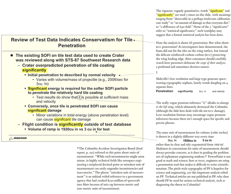
I think it's why I think teaching engineers how to draw and do good design is important. How big is a cubic inch? How big is the crater in the heat shield that we're talking about?
It would have been better to draw comparisons and explore things. Here's a simple sentence that could have done better;
"Sir, our test database was for objects the size of an average icecube. The thing that hit the wing was the size of seven and a half footballs. It's 640x larger!
[chart that shows just how much kinetic energy we're talking about]
We're looking at somewhere between 640x to 1000x more energy than we've ever seen. We have a problem."
A friend and I did an interview with Don Eyles a while ago and he said something that haunts me, "if you see something, say something" https://twitter.com/_areoform/status/1501589762599112704
I'd like to go a bit further. If you see something, design and explain something. Challenger is a great example of this; Dr Tufte covers it extremely well, just laying out the boosters and the blowthrough they experienced from left to right on a chart that has temperature as the X axis, you can see clearly that it gets worse as the temperature drops. But no one at NASA or Thiokol thought about doing that.
No one thought about humanizing the data. They knew how important it was. They tried to say something. But they couldn't express it.
It's not enough to just show people the data. We need to get people to understand it. And that's often social suicide.
It's easy for people to want to remain stuck in their status quo, no one likes the "negative person", but that's what ends up getting people killed in safety critical environments. And that's how we get messes like the ones we're in today.
One particular one that comes to mind is climate change, I am unsure if most people are aware of this, but it's very similar to the failure expressed here. Most of the scientists whose work is consumed by the IPCC and the models that are published by the IPCC know that the "consensus" is wrong. Except, it's wrong in the opposite direction to what certain people want it to be.
The reality is far worse than what the models suggest. The models still don't include the loss of permafrost - what's worse is that they don't model the non-linearity of permafrost loss, methane emission, that then sparks more warming and more permafrost loss etc, https://www.woodwellclimate.org/review-of-permafrost-science... nor do they include effects of how the climate would change of ocean conveyor currents shut down (AMOC in particular is of significant interest, https://www.aljazeera.com/news/2021/11/12/concern-grows-over... ). They also don't model the melting and release of clathrates from the ocean, or the effects of ocean acidification, and several other non-linear processes.
I had a very polite, but heated argument with one of the scientists involved and he told me that they aren't going to include that, because if they do, the numbers will look much worse and they'll be dismissed as apocalyptic loons.
Which brings us, elegantly, back to the point that Dr Feynman made in his remarks about the Challenger disaster,
"For a successful technology, reality must take precedence over public relations, for nature cannot be fooled."
> The article doesn't do the slides nor the evidence justice.
That's an understatement. A close reading reveals that it misrepresents the position of Tufte's writing, the conclusions of the investigation board, and the report of the subsequent return-to-flight group.
And it uses "sweetened" (fabricated) figures, to boot. <https://news.ycombinator.com/item?id=30622688>
Powerpoint doesn't communicate badly. People communicate badly.
If you are impressed by this, wait until you see Colin Powell's Iraq slides
How about death by a tiny gray serif font?
The more this comment gets downvoted, the more it looks like death by tiny gray serif font, making the comment quite funny.
The size looks the exact same as this very site to me. It's #5e5e5e (effective, as it's actually a slightly transparent RGBa value) against #fff, so a contrast ratio of 6.48:1, well within WCAG AA standards, and a tiny, slight shift to #595959 would be enough to meet AAA.
Chrome Lighthouse on both mobile and desktop said that TFA did not have a sufficient contrast ratio.
It doesn't look too bad on my desktop, but on my Android which is set to 130% it's almost unreadable. I had to use reader mode.
And it doesn't resize on mobile, probably because they're using px in their CSS instead of em or something scalable.
You were specifically speaking about serif grey text on white, which is pretty much what I just told you - WCAG AA compliant. [1] You weren't talking about Lighthouse nor mobile specifically, so I just answered with whatever info you gave out.