US Mortality Monitoring – Deaths, Excess, Z-Scores, State Map
usmortality.comA similar page for Europe: https://euromomo.eu/graphs-and-maps/
This is what I've been looking at a lot lately. I dont trust any data related to PCR-tests, as those tests are not one but many tests. The number of cycles used, and the number of chains looked for is different from PCR to PCR making their results useless for me as an interested outsider who wants to do some calculations.
Hence I turn to excess all cause mortality as my main figure. I personally know 2 people that had their lives shortened by the measures instead of the virus itself, so I take that into account.
The main problem I have with the US data (z-scores) is that they dont include 2018 which had a serious flu going around killing a lot.
The Euromomo data does show that 2018 flu spike of mortality. And that puts things in perspective.
Keep in mind the following: the flue spike was without any decent form of measures. We can do a lot to reduce those.
Also note that while your anacdotal evidence is sad, it does not take into account that without those measures they might have been as badly off as well due to even more sick people being around at the same time. People easily blame measures but forget that the alternative might be even worse.
> the flue spike was without any decent form of measures
I agree flu vaccines are worthless. :)
> People easily blame measures but forget that the alternative might be even worse.
Totally agree! But I'm just saying that the spike also contain collateral deaths (for lack of a better word). And yes it's totally anecdotal that I know two of those, and not know even one person who was even hospitalized from C19.
The effectiveness of seasonal Influenza vaccination depends on two things. First we have to guess which Influenza strains to vaccinate against, if we guess the wrong strains then it doesn't much matter that you're immune because you got a different strain anyway. Second the virus drifts even if we guess perfectly and it might evade the vaccine.
When you get the jab, both these things are still hard or impossible to know, so as long as the side effects of vaccination remain very mild for almost everybody it's worth a shot (pun intended). Some years it works very well indeed.
It's worth distinguishing between deaths due to measures imposed to manage the pandemic (which we could have hypothetically avoided by just allowing the pandemic to run its course, presumably killing millions more people) and those due to direct consequences of the pandemic which you can't avoid except by hypothesising "What if magically this virus didn't exist?". For example hospitals get overrun with patients and withdraw all but emergency care, resulting in excess deaths, but you can't wish that away. Or people are too scared of the virus to seek help so they die unnecessarily, again nowhere (except maybe China at the extreme?) told people "You must not leave your home to escape a violent partner" or "Don't call an ambulance if you have a heart attack, you might get infected" so those deaths aren't a result of a policy decision they're a consequence of the pandemic itself.
There's a third thing: Not enough people take it.
> I personally know 2 people that had their lives shortened by the measures instead of the virus itself
If you look at the global rates of excess deaths:
https://www.ft.com/content/a2901ce8-5eb7-4633-b89c-cbdf5b386... (look under “Death rates”)
It looks like the countries that had early and hard shutdowns (like Denmark and S. Korea), had almost zero excess deaths. Which at least to me seems to indicate that the shutdowns themselves have very low impact.
We (Lithuania) had a very early and strict shutdow last year and fared wery well during the first wave. We are going into the fifth month of the very strict shutdown during the second wave and we have tons of excess deaths.
I don't think we have the data to answer the question posed by the grandparent comment. Lifespans have likely been reduced by response to the pandemic. Those whose lifespans have been reduced are still alive and are not showing up in death statistics today.
For example, my grandmother-in-law was selfsufficient before the pandemic. During the pandemic she pretty much stayed in her apartment which resulted in significant loss of mobility. We're not sure whether she'll regain her selfsufficiency, which will probably result in her dying sooner rather than later.
That's very sad to here about your grandmother in law. I too definitely felt an impact of lockdown, it's not zero impact at all.
However looking at other places in the world (not Australia) that had ineffective measures, it's like comparing certain death for a large swathe of the population vs reduced quality of life that many, but not all will recover from.
Well the interesting thing is that the Euromono data shows a similar trend as the US data, especially if including the 2018 data. The 15-44 year olds while essentially not affected by the 2018 flu did see a spike for covid. I think it would be interesting if the group could be further split up into 15-24 and 25-44 year olds, like the US data.
Regarding the 2018 flu spike, putting things into perspective. I would say yes it does, because it shows how significantly bigger the spike for covid was/is.
> significantly bigger
In some cases. See the Euromomo z-index data per country. Some are unaffected by the flu and C19.
Where flu kills tops 0.1% of a population, C19 seems to kill 0.8% at most.
According to this, the percentage-wise deviation from normal range the last year has been worst for 25-44 year olds. Absolute number of deaths is, of course, higher for the elderly. But the relative change is biggest in that age group.
That's a rather different narrative than I've heard. I wonder what could explain it? Secondary issues related to but not covid?
By "narrative", I assume you mean the idea that "Covid doesn't affect the young by very much".
Taken as a proportion of total Covid deaths, that is very true.
Given that practically no young people die in developed countries, it doesn't take much to make a big change to the excess mortality figure for that age group.
My explanation has been that many of the elderly who died from covid did not have much live expectation left because they had suffered multiple diseases already. So in excess deaths they don't show that big, even though there were many cases. But the 25-44 olds would still have decades left, so every death makes a greater impact on excess deaths of their age group.
But my statistics math is on a very basic level...
That's not what excess deaths mean. Excess deaths is number of deaths above previous years average. It has nothing to do with age, other than tracking who has died at what age.
So why would you not be able to categorize excess death into age groups?
Last period 100 70 - 90 years old died. This period 110. If they died only a fraction of the period earlier, they would have shown up in the same category anyway with some probability.
This period 5 20-40 years old died, this year 10 Normally they would have died decades later, so they would have not shown up in this category during the period.
(Of course with small numbers statisical relevance decreases. But I have understood in countries with many covid deaths in elderly care excess deaths for high age categories did not increase that much over a year.)
This would show a 10% increase in the older group, but a 50% increase in the younger group.
Of course
True, but it will be interesting to see if there is reduction of the excess deaths next year. A. k. a. The harvesting theory.
I dont doubt Covid has caused a bunch of these deaths, particularly in the first wave. But it would be nice to break out suicides and overdoses, as mental health issues are on the rise as a result of lockdowns and the economic fallout.
Here in NZ during our much harsher, but only 6 weeks, lockdown we had a small number of covid deaths, but they were eclipsed by the drop in the road toll - thru 2020 the almost lack of a flu season due to the covid precautions meant a further drop in the annual death rate.
"road toll"?
Is that an idiom or do you mean fees charged to drivers?
"The death toll incurred by driving on roads".
yes this - we have a socialised medical system, the government understands that reducing the demands on our health system by reducing the number and severity of car accidents is a useful thing, it reduces the costs we all have to pay.
So our police, who are responsible for picking up the pieces, do continual public outreach encouraging people to drive safely/sober/etc the yearly "road toll" is a continual metric that is used to show how well we are doing as in "the road toll this easter has been higher than last year, please drive more slowly"
The fact that the 0-24 age range (typically dominated by car accidents and suicides) doesn't see much change suggests that the effect you are suggesting is small or nonexistent.
Your argument doesn't prove that. Using that logic, given that we (collectively) make much fewer car miles due to the lockdowns, we should see a downward change in that age range. Since we don't see a change, that may mean that suicides are on the rise, offsetting the reduction in traffic fatalities.
https://www.cbc.ca/news/canada/calgary/suicides-alberta-bc-s...
Here in Canada we've been told suicides have gone down during the pandemic.
In my city, in 2021, 10 Covid deaths and 13 opiate OD deaths.
This is FUD.
> This is FUD.
Really?
https://www.npr.org/sections/health-shots/2021/02/02/9620601...
https://www.aappublications.org/news/2020/12/16/pediatricssu...
https://abcnews.go.com/Health/opioid-overdoses-29-higher-202...
Ah sorry, UI issue on my HN app, it posted my response to the wrong comment. I appreciate the link to the sources regardless, in the current environment that's becoming more and more necessary.
Does anyone know where to find death statistics for the US for years prior to 2020? Apparently, 3,436,576 persons died in 2020, but what was the totals for 2010 to 2019?
Check out my google sheeet for Mortality data since 1999: https://docs.google.com/spreadsheets/d/1dvfMYnPrb_Ln9qvEZVuL...
The cdc fluview mortality page. You have to download it as csv, the web plots are flu and pnumonia eatimates.
One interesting observation is that the extra deaths during the pandemic are only a third of the deaths attributed to covid. That implies that two thirds of the covid deaths would have been expected anyway last year without covid?
Above 70, the death rate starts to skyrocket naturally. This was also one of the highest risk groups for COVID. A lot of people who were likely to fall down and die or have a stroke/heart attack and never recover instead caught COVID and died a few months earlier. Remember to hug your parents/grandparents as life is short and none of us is promised tomorrow.
That's accurate of other countries. Excess death outside of 75+ people who had a few more years left is zero.
> Excess death outside of 75+ people who had a few more years left is zero.
The data in this post seems to contradict that so you would need to specifically address that.
The fact you said "zero" rather than some small amount gives me some doubt you are debating in good faith.
https://www.cdc.gov/nchs/nvss/deaths.htm?CDC_AA_refVal=https... Is a good starting point. CDC is the keeper of those stats in the US.
I’ve added it https://www.USMortality.com/historical
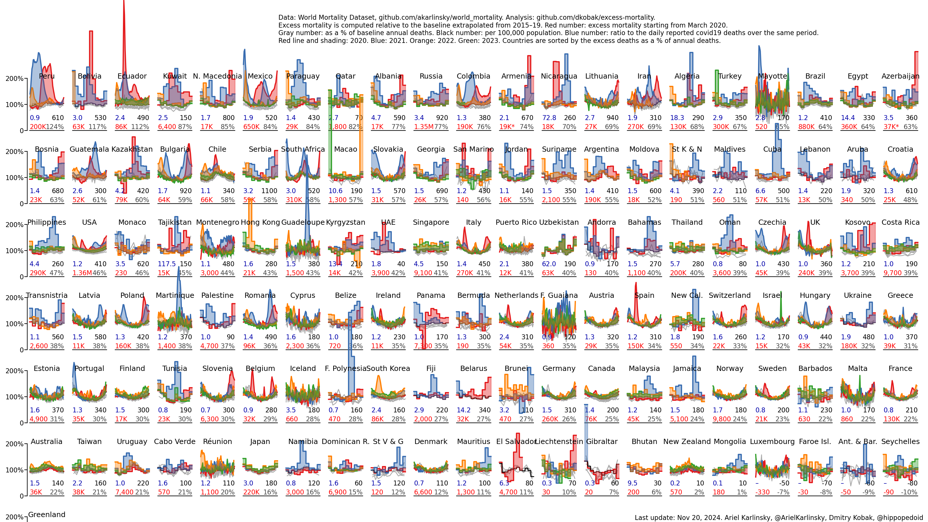
And here is the excess mortality data for all countries https://raw.githubusercontent.com/dkobak/excess-mortality/ma... from https://github.com/dkobak/excess-mortality
Would be interesting to also see top causes of those deaths
Only one year but
https://en.wikipedia.org/wiki/File:10_leading_causes_of_deat...
Does anyone have a list of all countries with annual deaths in 2020, vs prior years for the past decade?
Surely the best way to examine the true impact of COVID is to understand the raw death figures, particularly if there were factors such as weak 2019 flu seasons/deaths which may have contributed to mortality displacement?
A journalist in Slovakia did a comparison of current weekly deaths vs extreme values for 2000-2019:
https://dennikn.sk/2304197/prehliadli-sme-mozno-az-styritisi... - the grey dotted dash line is the extreme values for the last 2 decades, red line is the current deaths, black dotted dash line is the threshold of standard deviation.
The most extreme value in the last 2 decades was 1411 deaths per week, last week of 2020 had 2059 deaths per week.
These weekly death stats are not useful because if no one dies in week 1, but everyone dies instead in week 2 (plus those who would have died anyway in week 2), it will show week 2 as being catastrophic, and everyone will just ignore week 1.
We need the raw annual data which basically removes this noise.
If you look at the chart the death in 2020/2021 are well outside the extremal values for the previous two decades, and the "mass" contained there is much larger than the cumulative discrepancies for earlier in 2020. At that level of signal I don't think the weekly data can be dismissed as not useful.
I looked up Slovakia data specifically.
Deaths: 2020: 59,000 [1] 2019: 52,234 [2] 2018: 53,914 [2]
So a 9.4% increase from 2018 to 2020.
By contrast, Sweden had a 5.7% increase. [3]
Slovakia has lockdown and curfew.
Isn't the conclusion here that lockdown in Europe is failure, when with only voluntary measures Sweden was able to achieve a lower death rate?
[1]https://spectator.sme.sk/c/22594536/in-2020-slovakia-suffere... [2]https://countryeconomy.com/demography/mortality/slovakia [3]https://www.statista.com/statistics/525353/sweden-number-of-...
It seems implausible that lockdowns in Slovakia have achieved anything - by contrast lockdown may be contributing to deaths since people are not seeking regular medical care:
https://news.sky.com/story/coronavirus-lockdown-may-have-ind...
Well this is a different topic - the issue I was addressing was the utility of weekly data presented by ciceryadam, which you were questioning.
As to you new point - you are drawing your conclusions from disparate data sources, whilst ignoring confounding factors (as pointed out by ljf). The data on wikipedia give a less dramatic picture, and after adjusting for population things look even less dramatic (10.0 -> 10.8 per 1000 for Slovakia and 9.0 -> 9.5 for Sweden). I don't think you can draw serious conclusions from such limited data.
What else do you know about Sweden that could have skewed their figures? Great healthcare? Strong public support of the measures that were put in place? Trust in govt? Healthy community to start with?
To say that Sweden and Swedes took no steps to protect themselves and their communities is baseless - I assume you do not live there? I have friends in Sweden, and the lives they are living are very very different to the friends in Australia and NZ.
Many deaths in care homes early in the pandemic, that's what skewed their figures. If you took number for the second wave only they would score way better. Lithuania already surpassed Sweden by number of cases per capita, and is really close to surpass it by number of deaths per capita. Sweden never had lockdowns. Lithuania has been living in strict lockdowns for 6 or 7 months, I am not even sure.
If you check the graph in my first comment, you can see that the 9.4% increase happened onward from week 42, so it was the second wave that hit the country hard. By that time, the country gave up on contact tracing. Plus in the second wave , the lockdown was enforced only for people not tested by mass antigen testing.
You can compare Denmark and Slovakia (similar population size) for 2 different approaches to the 2nd wave, with 2 completely different outcomes. Denmark as a whole has as many people in ICUs as Slovakia has in one hospital.
Exactly, if you have a surplus of dead people for 15 weeks straight, that means something.
Best way to assess the impact in terms of deaths, but don't forget that the impact will also be on those suffering long covid symptoms.
My wife was first ill with covid this time last year, and is still suffering now. She didn't get covid that bad, wasn't hospitalised, and prior to falling ill was working out 4 days a week and a damn busy person.
Now a 15 min walk can see her needing to sleep it off for 2 hours.
We are very lucky that she wasn't working before this, as there is no way she could have worked this last year. She knows of many others who have lost jobs, houses and even partners due to the impact of their long covid.
So I'm always a little touchy when people act as though deaths is the only factor to record.
Do you have any evidence that these symptoms were caused by long covid and not by something else that changed at roughly the same time, like lockdowns?
Obviously I have none at all, though on online covid support groups you will find people from a range of countries that have (or have not) locked down to varying degrees - so should be pretty obviously not linked. It is so odd that people are so keen to question others long term impacts from a novel disease, when I've not seem the same effort put in to down playing the long term effects of SARs on people.
> Surely the best way to examine the true impact of COVID is to understand the raw death figures
Is it though? As an example motor vehicle fatalities went up sharply in 2020. Is this due to the pandemic?
If anything the pandemic should have decreased car accidents, because miles driven went down. It seems there’s possibly an orthogonal force at work. Possibly the rising market share of monster pickup trucks, which are particularly deadly to pedestrians.
My point is the pandemic was obviously the biggest change that happened in 2020, but it wasn’t the only change.
>Is it though? As an example motor vehicle fatalities went up sharply in 2020. Is this due to the pandemic?
>If anything the pandemic should have decreased car accidents, because miles driven went down. It seems there’s possibly an orthogonal force at work. Possibly the rising market share of monster pickup trucks, which are particularly deadly to pedestrians.
>If anything the pandemic should have decreased car accidents, because miles driven went down. It seems there’s possibly an orthogonal force at work. Possibly the rising market share of monster pickup trucks, which are particularly deadly to pedestrians.
Nice theory but I think it's far more likely that the pandemic completely upended "regular traffic" everywhere causing millions of people to be driving/walking at days/times/places and in traffic conditions that they were not accustomed to and this was a fairly instant change so pretty much everyone was flying by the seat of their pants. Predictable traffic is safe traffic and the pandemic changed normal traffic patterns in pretty much the entire western world creating tons more opportunities for mismatched expectations of behavior between traffic participants.
According to data in the UK from May last year, more likely to be in a crash (although total trips were down, as you note). Link below notes crashes around a couple of football events went from 16 (in jan) to 70 (in mar). I don't think pedestrians enter into it.
So perhaps more risky driving occurs when fewer other cars are around? Maybe the risk-averse stay home, leaving only riskier people to go out? Clearly, the pandemic had an indirect effect here though.
The quality and trustworthiness of that data will vary from very high to we know for a fact its made up.
I don't really get these excess death calculations.
Surely just looking at the past 5 years is not enough.
Wouldn't you at least have to take into account generations? (ageing populations) (So maybe 60 years of data?)
The linked graphs could easily just represent an older generation dying off. (Even the humps could just be regular flu seasons for an ageing population)
Then you have to choose a range for your generation 50-80 year olds etc
If Covid kills a large proportion over 80, and your range for generations is 50-79, the data would be completely off yet again.
There must be a lot more facets to take into consideration.
I feel like those graphs quite statistically weak. What am I missing?
It would be nice to put my money where my mouth is and actually just do my own study. But can't think of a country who would have reliable stats going back 60 years on death tallies.
(Semi relevant paper on looking at ageing population stats -> https://www.karger.com/Article/FullText/494025)
Over 60 years you would have to account for the many other factors that also affected mortality, for example better healthcare. That would increase the statistical error and reduce the validity of the results. And it isn't really necessary as long as your baseline contains enough data to be able to prove statistically differences from your comparison groups. Generations are taken into account by splitting the results by age and not looking back too many years, as even with flu, cold winters, etc... life expectancy still changes slowly.
Tend to agree, check out my sheet here: https://docs.google.com/spreadsheets/d/1dvfMYnPrb_Ln9qvEZVuL...
The mortality is as bad as in 2005 roughly!
Can you elaborate a bit?
I find the +/- sentiments interesting, it wasn't any intention of mine to approve/disprove anything, I was just sitting at home thinking were the original charts meaningful.
> I feel like those graphs quite statistically weak. What am I missing?
I think you're just missing the definition of "excess death", it's literally how much more deaths were registered against an average of the last years.
It's just a basic indicator that indicates that something has happened and further investigation is required to clarify the reasons.
If the "excess deaths" was raised because the "baby boomers" generation was dying off a further investigation would be required to identify that.
Thanks for the reply, stats aren't my strong point, I am sincere with my questioning.
My wording sucks, I don't think my personal judgement of "excess deaths" is "correct", — nothing like that.
It just kind of feels like, as an example, people trying to predict financial markets, throw in a few factors, and a few sentiments and thus, X does equal B^(Y * B)(blah % what)(huh ^ bleh).
The "further investigation" is the "investigation" I was originally begging the question for.
Not trying to antagonize you, I just don't really get why the originally linked article is "True", until further things are investigated.
Science is one phenomena that proves itself, that's great.
Stats seems very malleable, I've met some people who are good at statistics, I've personally visually plotted graphs too, and it all kinda seems bias. (I probably did them wrong)
Can any statisticians chime in? Is this a reasonable dataset?