Hacker95.css – Make Hacker News look like Windows 95
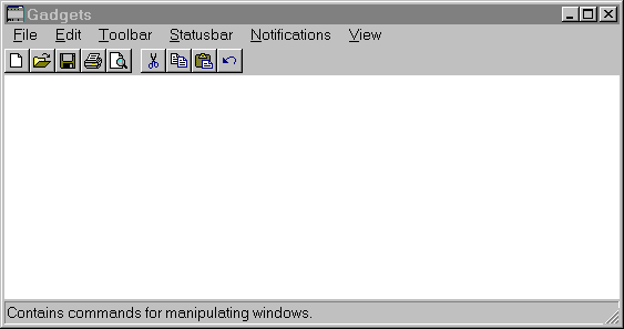
github.comLooks nice, but the shadows on the buttons are wrong: the top and left edges should be white, the other two black. This way, the buttons look more like elements of a status bar, those had the borders reversed to produce an "inset" effect (like in this screenshot: http://173.255.209.242/chhtml/toolkit/demos/Windows/gifs/gad...)
I was always slightly perplexed as to how that difference in orientation of colors leads to the out/in effect. I guess it's not so much the left/right but the top/bottom that really achieves this phenomenon, given how most daily light sources come from above (sun, ceiling fixtures, floor lamps) and there are relatively few instances of uplighting (landscaping, ...) around us.
The up–down orientation unquestionably comes from the near-universality of light sources being above you. You'll notice that intense up-lighting is almost never found in the natural or artificial world.
(It's true that upwards-firing lights are often used in interior decoration, but these are almost always to illuminate walls and ceilings above us which then bounce light down to the contents of a room. Also, some techniques in photographic and studio lighting do use some up-firing lights, but these act as shadow fill, never as the primary light source—except when an unusual look is intended.)
To the extent that we expect a certain left–right orientation, this will almost certainly be predominantly a matter of consistency with prior graphical user interfaces. The near-universal standard of a top/left lighting metaphor goes at least as far back as the original Apple Lisa/Macintosh which cast its 1-bit, 1 pixel shadows to the bottom/right.
The fact that people of near-identical cultures can natively integrate either left-hand driving or right-hand driving suggests to me that there's no inherent reason why it needed to be one way or the other. Had the first interfaces begun with a top/right lighting metaphor, we'd probably be all as native to that as British people are with right-hand-drive vehicles.
Upward-firing lights are aimed at the roof to spread the light and create more ambient light. So is primarily used as a down-light by reflection anyway.
I'm not sure the left/right shadows are a learned thing from user interfaces. As a kid, long before I got my first computer I was drawing 3D forms. Shadows always was drawn as light came from the upper left.
Maybe this is because I draw with right hand so prefer light to come from the left so I don't shadow my hand?
Now you've got me wondering if the left/right shadow preference might actually be rooted in other natural phenomena besides human dominant handedness, like something with the rotation of the earth a.k.a. sun setting in the west.
You're over thinking things there. More likely it's just an artefact of those interfaces being designed in the countries who read left to right.
Off topic but I like how you've referenced that infamous IRC meme in your HN handle.
What? The username just shows as *_ for me?
Our brains are hard-wired to assume light comes from above, and 3D "pop out" from shading even means we can identify the shapes faster. More info and references in this section from Mind Hacks (I was a co-author):
#20 Fool Yourself into Seeing 3D -https://books.google.co.uk/books?id=K6bjvFUcedgC&pg=PA57&dq=...
(It briefly mentions Susan Kare's work who designed the first 3D buttons in Windows 3.0 -- 1990!)
There's another effect going on here which is visual affordances: not only does the button "pop out" but we immediately see it as something we can push. That's from the psychologist James Gibson in 1977.
There are a ton of cognitive quirks that are useful to know when designing interfaces. The pop-out effect is one of my favourites.
It is an artefact of how we scan things visually. Most of us read top-to-bottom/left-to-right and habitually look at pictures with that bias, so when the brain fills in the missing height detail for a 2D display using the light/shadow indicators it defaults to assuming the light source is in the top left. The affect designed for us doesn't work as well for those whose primary written forms follow a right-to-left structure. Obviously, as you mention, the light source being assumed to be high comes from a much older source as our main natural lights are up high.
I agree it's bonkers. It's a direct corollary, but still a wild experience: turn your phone (/monitor/head) upside down.
The illusion of left/right is driven by which hemisphere you are on. On northern hemisphere the sun moves from left to right and the morning being brighter than afternoon. So top/left would be on average the brightest source.
Since it's my lunch break, I put together a PR: https://github.com/chowderman/Hacker95/pull/4
My CSS-fu is very basic, so it might need further tweaks to make button presses look right.
Or make them actual tabs.
It wouldn't be HN if I didn't say that I think Windows 95 had solid blue title bars rather than the 98/NT gradient.
But yeah this is cool :)
NT didn't have the gradients either. 2000 did.
Win98 did though.
That's correct. 98 was the first release to have it, chronologically speaking. 2000 was the first NT based Windows to have it.
So 98/NT didn't make sense to me. NT4, the last release to use the name NT, had a very Win95-like appearance. I also remember NT 3.51 (and I guess there were other 3.x) that had a very Win3.1-like UI despite being 32 bit.
Yeah you got me. Fair enough.
Windows 2000 was amazing and just my favorite OS. Saying that as a linux user.
Win2000 was the most perfect and least buggy Windows version of all time.
It didn't seem buggy at the time but you wouldn't want it on the public internet with all its security bugs.
It would be nice if Microsoft just backported security improvements and other kernel type stuff without messing with UI.
Of course but the problem with updates is that you can never only get security updates... You have to get "feature enhencements" too... It would be nice to have 2 branches.
I don't mean just security updates though. I mean systemic security improvements coming from redesigns of components. Some of the changes are feature enhancements in the kernel too, some affecting security.
For all the criticisms of UAC or the Win8+ app store I would sooner trust a sandbox on recent windows than I would on Win2k. Even the XP SP2 era had huge security re-vamps that Win2k never got.
And there are performance things. I happen to know that Win32 message pumps have a better locking scheme on Win7 than they did in 2k.
The issue is in order to get enhancements in the lower layers you get forced into other bloat higher up.
Disclaimer, I spent a few years as a dev on the Windows team.
1.x=1.x
2.x=2.x
3.x,NT3.x=3.x
95,NT4=4.0
98=4.1
ME=4.9
2000=5.0
XP=5.1
2003=5.2
Vista,2008=6.0
7,2008=6.1
8,2012=6.2
8.1=6.3
10,2016,2019=10
Makes perfect sense, right? Honestly I can deal with most of it, but couldn't they have realigned at 7?
Yeah, in early prerelease they had 7 report as 7.0.
But the story goes there was buggy code out there that said:
And they wanted Win7 to hit the Vista-ready code. So they kept major at 6 for a long time. I guess they stopped caring for Win10.if (major == 6) { // Do the thing that works on Vista } else { // Do the thing that only worked on XP and earlier }Even more to the point, the kernel major version number represented an implicit ABI compatibility for drivers.
Windows 4.9 could load drivers for 4.0. 5.2 could load drivers for 5.0. 6.3 could load drivers for 6.0...
Windows 10... can still load 6.x drivers, but it bumped the internal version number to 10.0. It is worked around because without an explicit "I'm Windows 10-compatible!" manifest, the OS just lies and reports an internal version of 6.3, along with the ProductName string remaining "Windows 8.1"
Makes sense, but they also had pretty aggressive detection of when compatibility mode would be helpful, so solving for the bugs with that seems like it could've worked. But I always like a good major version skip, e.g. Winamp (no 4, because they combined 2 and 3 to make 5), PHP (no 6, because... reasons), and nobody so much as thinks about IPv5.
Hacker News already does look like made in Win95 age.
Simplicity has strong potential for standing the test of time.
Combined with consistency.
I just let out a big oof IRL. Not sure if that it’s a bad thing or aesthetic though, to be honest.
Function over form. I don't think this is a bad thing, HN doesn't need to be any more advanced, it does its job really well as is.
Browsing pages of Who is Hiring when the comments move to other pages sucks.
Exactly. It works. Takes balls not to touch things that work.
It would be nice if it supported markdown, though.
It supports some markdown, but I agree, that and a dark mode (I made a really basic one for the Stylish extension) would be the only things I'd accept as a change.
Aside that anything like making the site full of JS for more functions would be a no from me. :-)
Really? With those little voting arrows?
Aptly put.
I also wrote something like this a while ago. I created a GitHub Gist so you can compare: https://gist.github.com/T0astBread/1e04aed3c8e1c3f19d5fc5e5a...
Someone mentioned how much they miss beveled buttons and how every button would be cooler with a beveled edge so I thought "well how about making everything beveled then", then I got a little carried away...
Anyways, mine is utterly impractical. I don't know how but I managed to make the site sluggish with just CSS. It's probably also broken in Chrome. This looks extremely cool in comparison!
To do this for Chrome, all you need is the popular Stylus extension [1] and OP can upload it to userstyles.org [2] for even more convenience (don't need to download a CSS file).
Also to be even more Windows 95-ey I recommend making the top links (new, past, etc.) look like a tab bar! (I really like the way the footer links look like a status bar.)
[1] https://chrome.google.com/webstore/detail/stylus/clngdbkpkpe...
If you don't want to install a 3rd party extension (maybe it seems like too much of a risk for such a frivolous purpose), then you can make your own. Just download hacker95.css and create a file called manifest.json in the same directory with these contents:
Then in your Chrome Extensions settings, find the option to "Load unpacked extension" and point it to your directory.{ "name": "Hacker News 95 Extension", "version": "1.0", "description": "Hacker News 95 Extension", "permissions": ["activeTab"], "content_scripts": [ { "matches": ["https://news.ycombinator.com/*"], "css": ["hacker95.css"] } ], "manifest_version": 2 }Word of warning about userstyles.org: this site (as well as original "Stylish" browser extension) is in hands of some kind of PR agency that made some very questionable changes in the past and neglects this product now.
As an alternative you can post (or link) your style at https://greasyfork.org/ which newly supports Stylus user.css style format or even self-host the file somewhere (github perhaps). Seems PR is opened already: https://github.com/chowderman/Hacker95/issues/2)
If you don't want to install a 3rd party extension (maybe it seems like too much of a risk for such a frivolous purpose), then you can make your own. Just download hacker95.css and create a file called manifest.json in the same directory with these contents:
{ "name": "Hacker News 95 Extension", "version": "1.0", "description": "Hacker News 95 Extension", "permissions": ["activeTab"], "content_scripts": [ { "matches": ["https://new.ycombinator.com/*"], "css": ["hacker95.css"] } ], "manifest_version": 2 }
Then in your Chrome Extensions settings, find the option to "Load unpacked extension" and point it to your directory.
So my anti-procrastination setting kicked in just as I made this comment and now I can neither edit it or delete it. I made the same comment again with proper formatting of the json file.
Stylus is available for Firefox as well [1] and it makes it a lot easier to install custom styles.
Honestly my immediate thought was, doesn't it kind of already? Just kidding
I don't think it's an insult anyway. I like the clean and simple look, and the Windows 95 theme gets a lot right in terms of UI design. Generally high contrast, easy to tell at a glance which widgets are clickable.
Hacker95 seems to get the Windows 95 buttons wrong though, showing them as 'sunken', and not giving a clear impression of being clickable.
It's a joky insult. Hacker News and Windows 95 have in common that they look objectively old. But what they also have in common is that they are function over form in an atypically pure sense, especially compared to some modern UI design.
Although I prefer a more balanced approach on the spectrum of pure function and pure form, pure function beats pure form any day
Seems no one has mentioned it yet but what bothers me about most of these stylesheet hacks is that they never get the font right. Granted I don't know what it would take to make the old font (MS Sans Serif?) browser-compatible, possible copyright issues aside(?)
Check out this article on this exact topic: https://vistaserv.net/blog/90s-fonts-modern-browsers
Granted I don't know what it would take to make the old font (MS Sans Serif?) browser-compatible, possible copyright issues aside(?)
If you're using a system that has the font, all you need to do is specify it by name.
Is it rigged to give you the good ole' blue screen of death every 10th click or so?
Because real Windows 95/98 had BSOD every 10th click or so and people could not get work done at all.
Funnily, in last few months on macOS Catalina i've got more kernel panics than in prior 13 years on Mac and 8 years of Windows combined.
I know this is unsolicited and I apologize for that, but check your Console logs immediately after you boot back up if you haven't already, there might be a hardware issue, and you ought to be able to get a good idea of what's going on by seeing what kext is affecting it.
My current and previous laptop have been fine, but I used to have issues all the time on a much older laptop, and the issue back then, I forgot exactly which piece of hardware it was, but there was a bug in one of the drivers that was patched in an update, I think it was 10.4.9 or 10.4.10 that had the issue, a known issue at the Apple Store; but they couldn't do anything about it from behind the Genius Bar. Generally if you're getting kernel panics though, there's either something wrong with a piece of hardware or with the driver for it, although it could be any kind of kext causing the issue if you have any 3rd party kexts installed.
I wish win10 had a win95 or win 2000 theme. I really love this aesthetic. I used to use win7 like this too.
I love retro-ish design but it's often not practical or pleasing, past the initial novelty, and a reminder of why things change.
This looks excellent (from the screenshot). It reminds me of a mid-late 90s Windows Usenet newsreader, which I wouldn't mind if every web forum looked like.
I’ve added a user style sheet in Safari somewhat recently to fix an annoying video player. I think it was easy to find in Settings. Can someone check if that works? Not near my laptop right now, and I use a 3rd party app on the phone.
It's easy to add as a user style sheet in Safari (Preferences > Advanced > Stylesheet), but there's no CSS selector to limit it to a domain, so it makes the whole web turn Windows 95 style, not just Hacker News.
This is a CSS stylesheet to theme your Hacker News in a Windows95/98 style
You have installation instructions for Firefox, which has like a 5% market share, yet you don't have instructions for chrome. That cracked me up
Chrome removed that functionality a few years ago:
https://www.reddit.com/r/chrome/comments/1ymfgw/user_stylesh...
(The comment there that removing this "is going to help increase speed significantly in the future" is pure BS. If anything, user stylesheet functionality was handled in native code --- just adding another CSS to the page --- which makes it far more efficient than going through the whole JS/extensions route.)
Ironically, IE11 is the last MS browser to support user stylesheets (Tools->Options->Accessibility) but Edge doesn't.
Even in Firefox, the fact that it's named "toolkit.legacyUserProfileCustomizations.stylesheets" is ominous.
The Internet is becoming more and more user-hostile, and it's not just websites who are responsible.
>The Internet is becoming more and more user-hostile, and it's not just websites who are responsible.
That's because the webbrowser has been pushed away from hyperlinked documents viewer, to essentially a virtual machine running untrusted code from anywhere.
It's probably Googles fault somehow. They seem determined to ruin everything.
https://bugs.chromium.org/p/chromium/issues/detail?id=347016
Issue asking for reintroducing native user style sheets in Chrome, with precise argumentation and long discussion. Does not seem likely to be heard, but symbolical starring doesn't hurt…
It would be helpful if this could have been indicated
Surely one of those other 95% of users can contribute with instructions that apply them.
Maybe 5% total user share. Certainly the tech oriented crowd uses Firefox at a greater rate.
My analytics also indicate 5%. Just how tech oriented are the folks you have in mind?
There are a few chrome extensions for adding custom CSS. Try "stylebot" or "User javascript and css", they both works ok.
Reminds me of those times when I built a website that doesn't have a functioning mobile view, put it on reddit, and it turns out that everybody is mobile
I think Chrome killed off that one popular extension for CSS insertion?
You could probably make a bookmarklet to pull the stylesheet from github and add it to the document stylesheets. Maybe using the new Stylesheet constructor?
You made fun of Firefox. That cracked me up
Heres a fun Firefox fact. Firefox handles audio/media files differently than chrome. Since it has a small market share, it becomes a rather annoying lose-lose: either spend a bunch of time to support Firefox for the ~20 people that will access your site using Firefox, or you don't support Firefox.
It's a shame that laziness is more important than interoperability. Part of the life of frontend or webdev is dealing with compatilibity issues, and it has been that way since forever. If you got into this biz thinking you could do that work and avoid those problems you thought wrong.
Laziness? Don't you mean unpractical and financially unviable? If I support Firefox do I support Edge, Opera, Android Webview, UC Browser? Explain how pragmatic prioritization can constitute as laziness.
Use Stylish/Stylus.
fits nice to my wetransfer alternative http://www.upload95.com
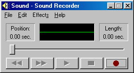
The gradient on the titlebar was from windows 98 btw, windows 95 didn't have it.
win95: https://upload.wikimedia.org/wikipedia/en/e/eb/Windows_95_at...
win98: https://upload.wikimedia.org/wikipedia/en/e/e7/Sound_Recorde...
I love this! Can you do reddit now please? :)
I like this, because nostalgia adds fun to news!
My personal preference, however, would be to see Hacker News look like IRIX.
Great project! A screenshot in the README would be awesome, though.
I already have lots of custom CSS for HN though :D
Now all we need is a good dark mode :)
I'm using darkreader for firefox, works ok.
That makes me feel 25 years younger!
Sir/Madam, you are a hero!
Themes...
Sitting in these Zoom meetings, that's about all I think about.
Three Participants: https://mediad.publicbroadcasting.net/p/shared/npr/styles/pl...
Four Participants: https://www.feelingthevibe.com/wp-content/uploads/2019/06/NU...
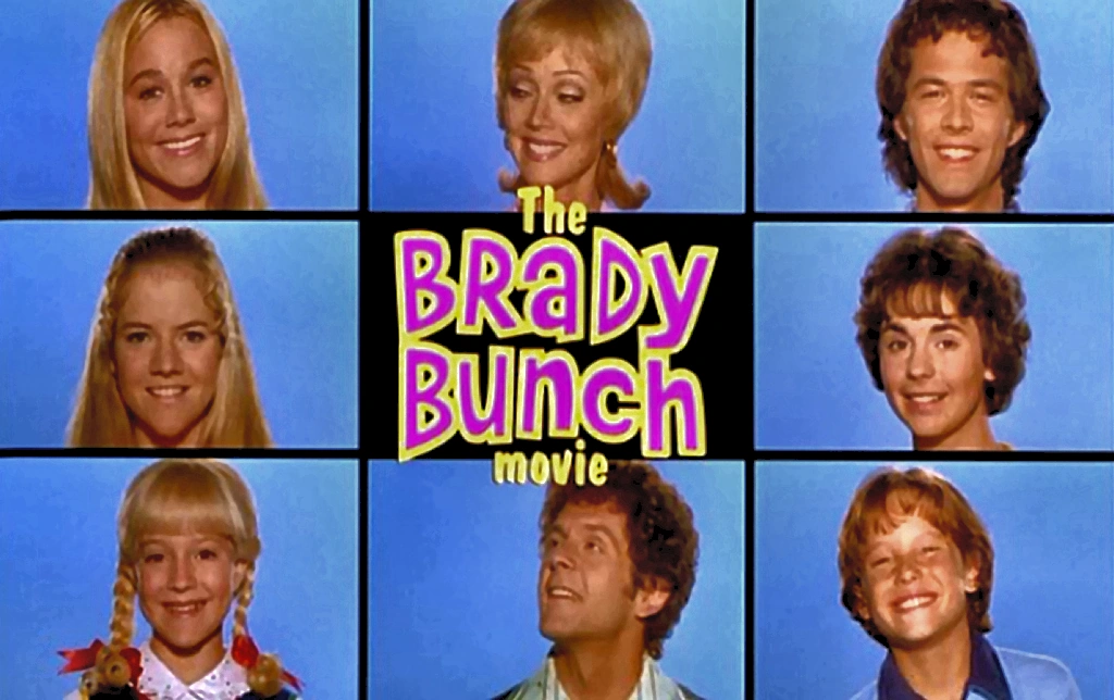
Eight: https://vignette.wikia.nocookie.net/thebradybunch/images/3/3...
Nine: https://i.pinimg.com/originals/0b/a1/b6/0ba1b63cf281efbe48eb...
Silly.
Sorry.