Routed Gothic Font
webonastick.comFor a newer font in this vein, I'd look at B612, a font designed in cooperation with Airbus specifically for visibility inside cockpits: https://github.com/polarsys/b612/blob/master/docs/B612-Leafl...
I'm also quite surprised that the symbols for "O" (capital O) and "0" (zero) are very similar, even in the monospace version of B612.
Cyphar, two years ago you posted:
"Well, there is a port of glibc to UEFI, so one could very easily "boot into Emacs". Strangely I've not seen anyone do this."
Can you hook me up with that link :) Cheers.
Very off-topic but hilarious.
Back to topic: inability to distinguish O and 0 seems pretty terrifying for avionics. Related, I love SF Mono, but it's so hard to read 0000080 in small fonts (try it).
Yeah, very off topic, terribly sorry. My brain won't let me write 0's without strikethrough anymore.
...and for an older font, look at Futura and its variants --- whose users in aerospace included Boeing and NASA.
And which might be known for a few as the main body font of the AD&D first edition books -- not the best use case for it.
Too bad the () and the [] look so much alike in the monospaced version.
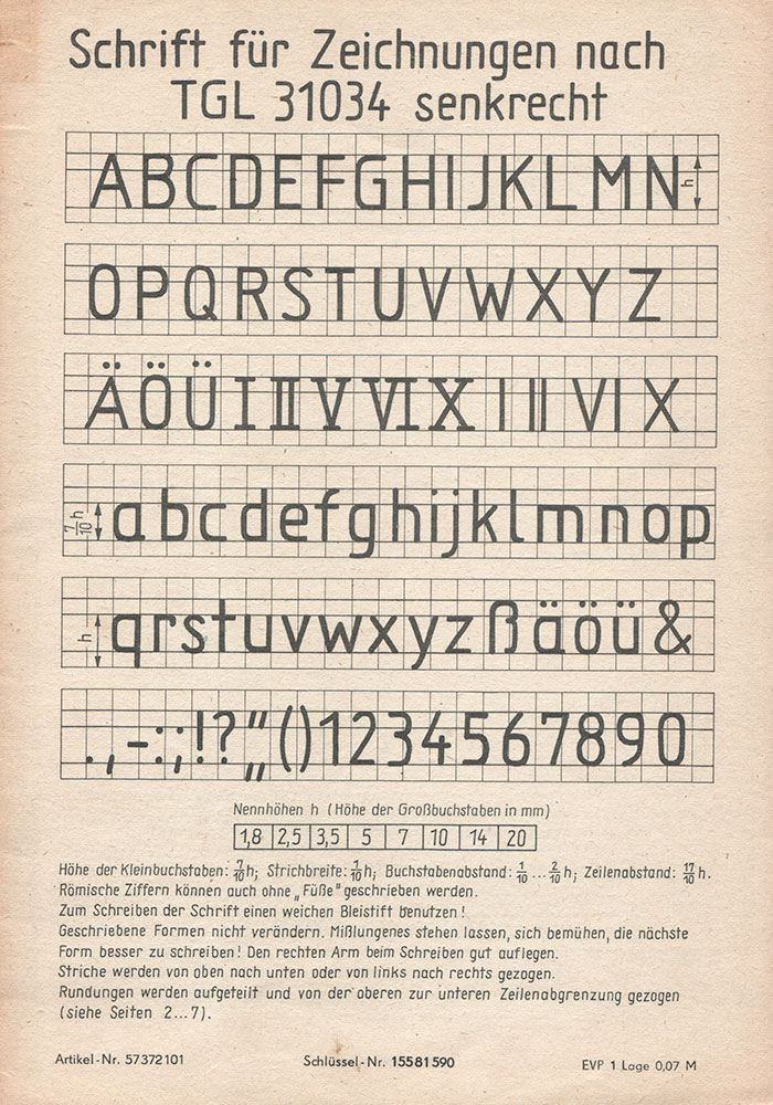
Sort of related, there's DIN 6776, a German standardized font used for technical drawings:
https://de.wikipedia.org/wiki/Normschrift
https://www.typografie.info/3/uploads/99b804cee64ef8c64ad900...
I had to learn that one in drafting class in middle school.
DIN standards are local derivatives of ISO standards.
There are few widely used "Technical lettering"[0] standards: «ISO 3098»(EU/International), «ASME Y14.5»(US) and «GOST 2.304»(ex-USSR).
There are few FLOSS fonts which cover «ISO 3098»[1,2,3], «ASME Y14.5»[3,4,5] and «GOST 2.304»[6,7,8] technical lettering standards.
[0] https://en.wikipedia.org/wiki/Technical_lettering
[1] https://github.com/hikikomori82/osifont
[2] http://peter-wiegel.de/TGL.html
[3] http://peter-wiegel.de/TGL_0-16.html
[4] https://www.fontspace.com/micronus
[5] https://cstools.asme.org/csconnect/CommitteePages.cfm?Commit...
[6] https://bitbucket.org/fat_angel/opengostfont/
Seems like ISO 3098 is significantly newer than DIN 6776, so it's the ISO standard that's derivative of the DIN one.
Well, you are partially right, because most of "DIN" standards already replaced by "ISO".
But there are still many "DIN" standards that now replaced by "DIN EN ISO", e.g. German (local) version of «ISO 3098» (which replace «DIN 6776») is «DIN EN ISO 3098».[0]
[0] en.wikipedia.org/wiki/List_of_DIN_standards#DIN_6000_to_DIN_6999
Thank you for posting this! I've been looking off and on for this for ages and ages.
Trivial factoid: my understanding is that the Gorton pantograph fonts came first, and that the Leroy lettering sets were manufactured using the Gorton fonts. But I don't have a good source for that, so I could be completely wrong.
I had not heard of those brands, I had Rotring [1] lettering stencils to match some of their pens.
If people aren’t familiar with the Leroy Lettering system here is a video of it: https://youtu.be/GZRvQDMBEOE
This font was also used by EC Comics (their comics included Tales From the Crypt). Here is another font based on that which is more fuzzy: https://caseyburns.com/artwork/font-design/
I'm pleased to see he implemented the vital U+1F4A9 code point.
Ah, a mainstay of technical drawings and engraved office signs.
Certainly required in the description of the accuracy of many of them.
Now it needs U+0CA0....
https://www.fileformat.info/info/unicode/char/0ca0/index.htm
I learned to write in this style by hand in an engineering graphics / drafting class in college.
I too find the high concentration of upper case fonts, especially Courier New, in engineering and especially EE, to be kind of relaxing and pretty.
It's not ugly, it's beautiful.
At the risk of sounding "out of touch with reality" and "retro nostalgic", I strongly believe that a lot of clean, sterile work took place in the 1965-1985 era. From UNIX to SR-71, everything mankind did in the technical space was minimal, purposeful, clean, legible, durable, maintainable, modular and many other adjectives that would compound on the idea of creating a truly better product or service. Marketing took a backseat, science and data mattered and advertisement was truthful.
Today's world seems broken, fragile, noisy and unmaintained. May be that humanity needs to unwind, rewind back a couple of decades and try again. If you play the scenario of human evolution multiple times, I am sure a large scale system such as global society would end up in a different state... every time.
Reminds me of the story that Kyoto, Japan didn't get ruined because one of the military commanders in charge of the nuclear bomb drop locations, had a soft spot for Kyoto... and instead chose Nagasaki and Hiroshima. [1]
If we were to replay human progress, I want us to go back to that era and relive the engineering life. Must have been amazing to work in a technical field in the 70's and 80's. Now we have AI and Quantum and all these fucking buzzwords, largely perpetuated by people who have no clue - marketing and PR folks.
[1] https://www.theatlantic.com/international/archive/2015/08/hi...
I keep going back to the old AT&T phone book fonts like Bell Gothic[0] and Bell Centennial[1] largely because it was designed to be legible at small sizes when using rather primitive printing methods. In a more modern context I find it works really well on charts and whatnot, even scaled down and compressed a bit more[2].
0: https://en.wikipedia.org/wiki/Bell_Gothic
Perhaps what has survived into the 21st century are simple designs and less so complex ones.
Survivorship bias at work.
Unix was a reaction against failed complex designs. So was the F-16, maybe a better example in military aviation because the SR-71 had such a unique purpose.
Popular and complex things from that era have been forgotten: PL/1, the VAX instruction set, overuse of manifold vacuum to power car accessories.
One can hope that simplicity comes in waves. Complexity is popular right now.
SR-71 was indeed extremely complex and expensive to operate. They got rid of it as soon as they could.
There are good free books available of the subject. Just looking at the amount of heat management and the required systems and heat exhchangers...
> Now we have AI and Quantum and all these fucking buzzwords
“Quantum” is from the 1920s. It’s not really a buzzword but more an adjective describing our most accurate model of reality yet that physics can provide.
The way it is used in today's marketing related to Quantum Computing is pretty fricking crazy though - I recently stumbled upon a good example:
Microsoft Quantum: https://www.youtube.com/watch?v=ba88EwG5b0Q
If this isn't full of buzzwords, what is!
> minimal, purposeful, clean, legible, durable, maintainable, modular
Yeah, the modernist ethos. Today those would sound featureless, single-minded, featureless (yea, again), oversimplified, lasting beyond its usefulness, unoptimised, repetitive.
As any engineer, I also like the modernist thinking better, but it's not realistic, life is messy and complicated.
It may be the size on the page, or glyph rendering artefact but this font doesnt look... consistent. Dont get me wrong the font is brilliant, however atleast for me there are some points at which the rendered glyphs are over cut. Another way id describe this is the antialiasing is not consistent. Its like layering the same text on top of the other multiple times.
The author mentions that there’s no hinting, which may explain what you’re seeing.
Wow, this is triggering some kind of memory cascade in the back of my brain that I simply cannot place. I know this font, but I really can't say from where.
The closest guesses I can come up with is the Commodore 64 Programmers Reference Guide, or maybe an old terminal or computer magazine. But I could easily be wrong.
Either way, I love it.
Perhaps Forrest Mims of Radio Shack Engineer's Notebook fame?
https://hackaday.com/2017/01/18/forrest-mims-radio-shack-and...
Wow. I think that might be it!
This kind of writing seems to be the equivalent of Normschrift in the US; it's all over schematics from the 60s and 70s (sometimes even the 80s). Just like Normschrift written by craftsmen it looks super-regular, almost like computer set type, except it has tiny variations between draftsmen, making it clear it is actually written by hand. (Some people use templates to write Normschrift; a looked down upon practice, generally not permissible in exams).
To me it looks like the Simplex font from AutoCAD (which I believe was based on a selection of characters from Hershey).
I like how under unicode coverage, the one emoji that is covered is the poop emoji. Human universals I guess.
I love the feel of this font.
> "I created this font by purchasing a Leroy Lettering set, using Inkscape to trace the scanned letterforms of one of its templates, and some FontForge Python scripting."
How does this work from a copyright/legal perspective?
https://en.wikipedia.org/wiki/Intellectual_property_protecti...: "Typefaces cannot be protected by copyright in the United States". (Note that fonts--e.g. a .ttf or .otf file--can, though.)
Other jurisdictions do provide protection for the abstract shapes represented by typefaces.
Guess why so many Helvetica impersonations/clones exist:
The thing is called "tracing" and quite common.
The actual code (which means the ttf/otf) is protected under copyright. The shape of a letter isn't and can't be by any form of IP.
So: You're not allowed to redistribute the font file but creating your own font which just happens to look alike is perfectly fine.
Thanks.
So, a given "specification" (how a font looks to the human eye) can have many different "implementations" (ie. TTF files). The specific "implementations" themselves can be copyrighted, but somehow not the "specifications"?
If so... assume one TTF file which is copyrighted, pay-per-use license. Assume another TTF file, which is open-source, free to use and redistribute. The files both implement the "Helvetica" specification, rendering the same letters to the human eye. How "different" must the free implementation be from the paid one, for it to not be considered an infringement?
Since the shapes afaik can't be copyrighted: Your selfdrawn font has totally the right to look the same.
They probably won't however, since you might be able to copy the shape, but for being displayed on screen you need a process called "hinting". That is the term for making pixels out of the shapes. Professional fonts are hinted by hand, making it look neat even in small sizes. There is auto-hinting, but it only gets you so far.
This is pretty much the same as Comic Sans, except Comic Sans is a bit more curvy and fun. Routed Gothic is what Comic Sans should have been.
You should check out Comic Neue. http://comicneue.com/
Related to this one, has anyone identified an equivalent font for what was used in the Apollo CSM and LM cockpits?
Wasn't this just Futura?
Oh hey it might have been. I dunno how I missed that. Thanks!
Why does it implement just a few of the superscripts, but not all?
1, 2 and 3 are in the Latin 1 block, 0,4-9 are at U+2070-U+2079.
I've been on the look for this for a long time. Thanks!
KiCAD 6's font support can't come soon enough!
Would love it in monospace variant.
Brick Hect would be proud.
An OpenType tabular numbers feature would be a nice addition, for numbers in tables. I think it would mostly be a matter of adding a hook to the 1 like other similarly-proportioned industrial fonts.