Minimalist renditions of international brands
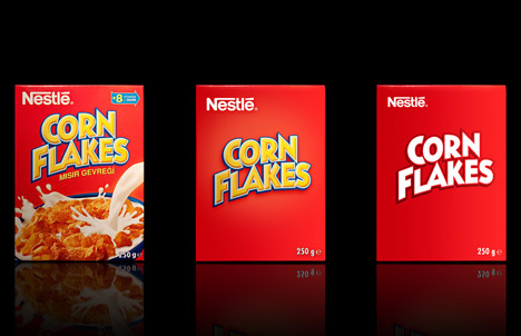
dezeen.comI think the Corn Flakes example (http://static.dezeen.com/uploads/2010/12/dzn_Minimalist-Effe...) is a good example of how this approach of minimalism for grocery type consumer products does a lot of damage.
Yes, across the board we still know what the product is but the feelings and the senses of the brand are gone. The Corn Flakes doesn't look like a yummy breakfast anymore. It might as well be the cover of a super hero mag. As already mentioned, the product is no longer unique. It might as well be the store brand.
This isn't effective brand minimalism (in my naive opinion). It's packaging minimalism (minimizing printing costs).
Maybe the reason the Nesquik box is bright yellow and has a colourful cartoon character on it is that kids in the supermarket who might not be able to read or differentiate Arial from Helvetica can still recognise, point to and blackmail their parent with tears to grab the box with Nesquik bunny which they've seen on the TV. This seems to be design in a vacuum.
This is a pretty lazy foray into minimalism. It should be about breaking the product down to it's most basic components, not just removing the background layers of a psd.
Isn't it more of a design exercise that shows how removing background layers of a psd affects brand/product impressions? It's a thought experiment, not a marketing pitch - using a very simple idea to show some interesting variations on brand image.
Removing any image and leaving text isn't much of an experiment, let alone exploration of minimalism.
I'm most impressed with how progressively "upmarket" they become. You could charge multiples more for the minimal version in a different context.
As muji [1] is to a department store, the appropriate store for these would be to a supermarket.
I'm also reminded of the quote "Simplicity is the ultimate sophistication" (da vinci?)
[1] http://muji.us
The food packaging loses a lot of meaning. The original Nutella, Nesquick, Toffifee, Corn Flakes, Lindt and Pringles packaging all show what's inside or a "serving suggestion". If I didn't already know what the product was, it'd be a lot tougher to know what I was buying.
The same applies for the Durex packaging. I assume that Durex Select condoms are fruit flavoured or scented, because there's fruit on the box. I can't make that assumption with the "minimalist" packaging.
I think they do look good, but design isn't a synonym for modernist aesthetics; it has a goal and I don't think the goal is being met by these.
I agree that if you didn't know what the product was, the minimalist designs would not work, but I get the impression the designers chose these brands because they were already widely known (in some places, anyway) - once you've established that you make X, and people associate X with you, there's no longer a need for a serving suggestion.
These look really good on a solid black background. On a supermarket shelf with hundreds more, some would be downright eerie. Solid red wall of cereal boxes.
This is more accurately reductivism/reductionism, there is no requirement for there to be "less" when dealing with minimalism and that was never the goal of artists who followed that school.
Reminds me of the "No Name" Brand in Canada (maybe local to certain provinces; Google Images: tiny.cc/nonamepics). It's interesting because the brand has purposely gone minimal. It's easily distinguishable treatment and lack of loud elements actually make them much more distinguishable in supermarkets.
Despite what some have said, I think in general these are done fairly well. Some are great, some are worse, but overall it's decent.
No Name also heavily competes on price. You have to look very closely when dealing with No Name, for instance No Name veg is frequently Grade B instead of Grade A. I'm not sure how CFIA grades veg but I noticed that the No Name peas I bought tasted like crap and upon further inspection I saw they were Grade B.
I can't imagine being able to visually distinguish products in a grocery store selling these pared-down brands.
While I'm really into minimalism, the minimalist packaging doesn't appeal to me, simply because it looks like "white brands". I don't know if that's used in English, so I'll give an explanation : a "white brand product" is a product which mimics a better know product but which is priced much lower and, most often, is of much worse quality. It may be conditioning, but it doesn't change the fact that I wouldn't buy the product.
This sentiment is also expressed by the first commenter on the page :
"dutch supermarkets did it with their low budget labels and that was the reason i came home with two pakages of strawberry yogurt instead of buttermilk this week. it looks nice, but it's confusing when shopping "
I must admit that a few looks better than the original tough : Red Bull, Lindt and Schweppes.
No doubt this appeals to people like us, steeped in the popular aesthetic trends of the web. However, a brand would have to be very well known to be able to pull off a design like that for these sorts of mass market products.
The Schweppes and Lindt ultra-minimalist designs are really good. They retain all the brand recognition while removing all cruft. The other ones aren't bad, but they're not great.
I thought the Schweppes one was easily the best but the Lindt version took away from the luxury feel of the brand and damaged the buying experience.
These renditions ignore illiterate or lazy shoppers who rely on pictures for their purchasing.
Also, shoppers who don't speak English as a first language. Whenever I'm in the ethnic isles at the local grocer I heavily rely on pictures to figure out what stuff is.
I find most of these 'minimalist' renditions are vastly less attractive than the original ones, to the point where I think I would stop buying them in favor of a more attractive competitor (if I would be buying them; I never buy most of these products). However, true minimalist designs are often more attractive than 'decorated' counterparts. So I think these aren't minimalist renditions; just bland renditions.