New logo
slackhq.comMarketing veteran here. Just like Uber and Instagram, they messed up big. They took something iconic and replaced it with something forgettable. The first sentece after they show it tells the lie:
"Firstly, it’s not change for the sake of change."
Unfortunately, due to the nature of company politics, this kind of thing usually happens because a new CMO or other exec comes in and needs to "mark their territory". Marketing in tech right now is having a big problem with people rising to the leadership ranks that really don't understand the basic fundamentals of the craft.
There is just so much wrong here.
Can anyone explain why all the 'incidental' graphics on the website are printing press related (halftone dots, mis-registered colors)?
What the hell unique lineage does slack trace to the printing press? Also how does that align with the new ultra generic could be any kind of business logo.
And let's not even talk about that sweet negative space swastika.
> And let's not even talk about that sweet negative space swastika.
Oh god, cannot unsee.
Edit: It's not even negative space. I just see it as a swastika.
Oh come on. There are other logos like that. Do you see a swastika on Google photos?
Why not "look at that sweet negative space windmill"?
Eye of the beholder, I guess.
>Oh come on. There are other logos like that.
Yes -- on asian temples...
The google photos icon is obviously a windmill, there's not whitespace for lines.
The nazi swastika is counter-clockwise. But it was close.
> that sweet negative space swastika.
It's not facing the same way as the Nazi one, first off, and would you also say that's a problem for Sun, or for Columbia (bikes/outdoors)?
Has there ever been a case where a corporation when to a design firm, and the designers came back with "Your branding is already excellent, and we think your best bet is to not touch it"?
(Call it the Miracle on 34th Street response.)
Yes but obviously these do not get written up as case studies by the client or firm.
And you might be surprised by how often the client, rather than being reassured, simply takes it as proof that that design firm is not "with it" since they can't see what is (to the client) obvious deficiencies in the branding.
Generally speaking, brand owners who are happy don't reach out to design firms, and brand owners who are unhappy won't suddenly become happy just because one firm told them the brand is fine.
I personally know somebody who responded to a client in this way, but I don't know of any public documentation of this sort of response happening.
I personally don't like the logo, but is it really fair to say Instagram and Uber "messed up big"? Because they're both wildly successful companies with highly recognised brands. Maybe the way you and I have been taught to think about logos and branding is.... wrong?
Instagram is a shrug. Uber's 2016 change was a clusterfuck.
Uber went from a stylized Ü to the Chase Bank logo [0], as part of a grand brand strategy that fractured regular polygons that somehow supposed to make you think that they weren't just cab service. (Seriously, they called their 2016 suite of logos "Bits and Atoms" [1].) People literally lost the app on their phone. If it wasn't a mistake, they wouldn't have changed their logo to simply the word "Uber" in less than 2 years if it wasn't seen as a mistake.
Yes, we do think about them differently. Uber and Instagram are wildly successful but not ubiquitous. The ultimate test is "will grandma use it?"
Grandmas use Google, Facebook and Amazon but generally have not adopted Uber or Instagram yet. Winning over those kinds of customers requires a different GTM strategy and different marketing than your first couple million.
It's a shame, too, because the technical reasons they described were all completely sound — but are no reason for them to have thrown the baby out with the bathwater.
I felt like the technical reasons were also sound. But yeah the old logo was better, so go figure :/
If I went in blind and saw the logo animation, I would have said it was something related to Google Home.
If the colors were in different positions I would have thought it were a microsoft product. Honestly for a second I thought, "did microsoft buy slack and integrate it with teams"
>Marketing veteran here. Just like Uber and Instagram, they messed up big. They took something iconic and replaced it with something forgettable. The first sentece after they show it tells the lie:
Yep; exactly. These companies are successful and their logos are recognizable. Google had the right idea, they become successful and then they tweaked their logo over the years: https://www.digitaltrends.com/web/history-of-the-google-logo...
>Marketing in tech right now is having a big problem with people rising to the leadership ranks that really don't understand the basic fundamentals of the craft
Can't blame them; tech industry has been focused on tech and some business and of course people from other departments are starting to figure out they grow their career in leaps and bounds just by switching to a tech company rather than fighting in the highly competitive playgrounds of ad/marketing agencies and other companies.
Better to be a big fish in a tech pond than a small fish in a marketing pond.
Yeah this seems to be pretty much the definition of changing for the sake of changing. Just somebody tries to prove their existence, prove that they've got something to do. Thought it is related to the design team but apparently the decision has to be made by the marketing team, and the design team is just the executioner then?
I like the new logo. The old one looked harsh and old. This one is friendlier. It is a shame that it isn't a hash anymore but eh.
Nobody will care in about a week.
No, they did change it for the sake of change. The new logo is pretty ugly.
That's what the OP said: "The first sentece after they show it tells the lie"
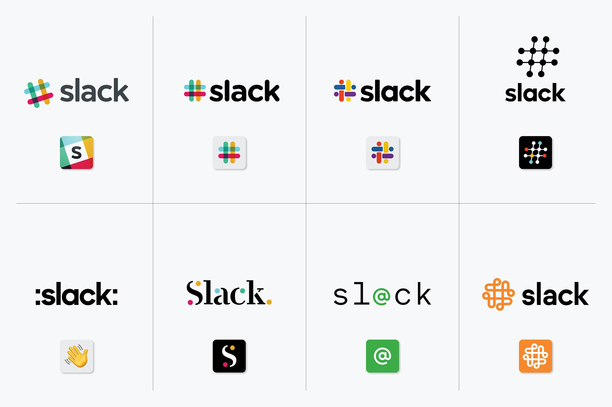
This feels so generic. I get the problem they're referencing with too many colors and not working in all contexts. But the human mind being what it is, I never had a problem connecting "rainbow-colored #" with "Slack". This...this is just some kind of blob. I couldn't tell this apart from a big pharma company, or some kind of conglomerate that makes everything from toasters to jet planes. I'm reminded of the Philip Morris rebrand to Altria, even as far as a generic colorful squarish logo. It's gone from "# means Slack" to "I guess that's Slack...?"
^THIS.
It does feel generic. I'm actually retroactively impressed that the old one looked so classy using so many colors (pour one out for https://metalab.co, who is doing just fine). I actually loved the different treatments—the Slack brand always felt like one of their strongest assets. It looks like the Joomla logo now – https://www.joomla.org/
Agreed, the '#' had a long history of indicating a channel, like on IRC, and by extension text-based communication.
This - the # wasn't a random choice for slack. And there's no shame in that.
And for those not familiar with IRC, the association of "#" with Twitter hashtags says "communication" too.
And for those not familiar with early Twitter, the hashtag was not a feature of the platform, but a shorthand way to indicate a topic. This of course was recognized and formalized by Twitter soon after, but I find it fascinating that it was a feature essentially developed by the users and more simply recognized by the platform later.
99 Percent Invisible did a whole show on this a while back: https://99percentinvisible.org/episode/octothorpe/
> a shorthand way to indicate a topic
And I imagine it was also inspired by IRC channels.
100% slack is essentially evolved irc.
The part I quoted was about Twitter, not Slack. Slack's relation to IRC was already mentioned. Essentially, my comment was "Not just Slack, Twitter too was inspired by IRC."
I'd bet that quite a lot of early Twitter users were also IRC users.
It was nice homage to what they were ripping off, I mean modernizing.
To add to the generic feel they've changed the font for "slack" to be very similar to the fonts used by every other tech company ever.
going through a "rebrand" is not something most companies undertake lightly.
> I'm reminded of the Philip Morris rebrand to Altria
IIRC that rebrand was done to distance the company from cancerous associations with the name "Philip Morris", whereas the only reason I can think of for Slack to do this now is to give them a quick short-term publicity boost to make them more relevant to "retail investors" -- that is, this corroborates rumors of a public offering later this year, and imho means that it's going to happen sooner rather than later.
It looks like a # woven out of thread that changes color when it ducks underneath.
More interesting for the HN crowd I think is the article from the actual design company that did the redesign: https://www.pentagram.com/work/slack
At first I thought this was interesting, mainly because of all the design talent that is at Slack already. But then I realized, it was probably just an easier move to get an outside company to do it and make it a lot less political than had it been done in-house at Slack. And well, Pentagram is also huge, to be fair.
I much prefer the (hopefully satirical) Pepsi Gravitational Field [2008]
https://www.goldennumber.net/wp-content/uploads/pepsi-arnell...
Reading this without context, it's actually completely unclear to me whether it's satire or serious.
A lot of those “logo explorations for the octothorpe” look like swastikas to me, including the final shape. Basic shape I suppose, easy to find in most any circular-comprised-of-geometric-shapes kind of design, but still imagery you’d probably like to avoid associating with your brand.
Still, I love these kinds of process breakdowns. Having been involved in writing a few of my own, I know there’s probably a lot of pretentious nonsense to fill in the blanks (i.e. designers mess around a lot when working) but still it’s a nice read, short as it is.
I was playing around with the logo for my company, which features a configuration of overlapping boxes. A significant percentage of my brainstorming iterations ended up as swastika-esque shapes. Go figure.. Now I'm not a designer at all, just fiddling around, but those versions ended up in a not-to-be-opened folder immediately, because.. of course it shouldn't see the light of day! That's a bad association waiting to happen
But Pentagram didn't let that stop them, did they. Guess that's why they get paid the big bucks
I mean there is a swastika in the negative space as hilariously pointed out but the first reply to their logo anouncement on twitter. le'woops
In case you miss the link to the background story:
What do you think it cost to get this slack logo designed from a company that prestigious? I see they also did rolls royce
Anywhere from $100k to $1m; their partner Michael Beirut was involved, so I would guess it's on the higher end of the scale.
A partner is involved in every Pentagram engagement though. Pentagram is not really like a huge Landor-esque firm, it's basically a series of small design consultancies each led by a partner that are loosely tied together. So anything that Pentagram is gonna do, at least one of the partners has to get behind it.
In some ways I guess that makes it very loosely like a VC fund.
$100-250k range given this includes logo, brand identity, motion design, comprehensive visual design system.
From a big-name shop like Pentagram? I'd expect that to be higher.
based on my experience a corporate rebrand is the US is closer to $500k
No. It'd be closer to $1m.
Seconded. In these type of high visibility projects and prestigious consulting companies usually charge in hundreds of thousands and in millions for a single deliverable (narrative document, logo, brand). The whole process might months to a year with several people involved from the agency.
And ABB— that logo has been burned into my brain
Agreed, they have a pretty impressive and aesthetically pleasing portfolio:
Paula needs to retire. She has ruined the Library of Congress logo - the classic Library of Congress logo by C&G&H with this crap: https://www.pentagram.com/work/library-of-congress/story
It's like they recycled left overs from the EFF logo job.
Pentagram is hit or miss depending on who leads the project. Michael Beirut is one of the better partners and designers at Pentagram.
I'm in full agreement.
like...seriously? they really thought there was improvement to be made on the Library of Congress logo? Its a book...and its nice and iconic, recognizable. They said the new design gives a brand identity thats more "accessible"...what is not accessible about a book? I get that the library has more than books, but that doesn't really make the old logo any less relevant.
That's quite a reaction you're having here.
:-)
This stuff bothers me. Like the day when they changed the legendary Vignelli's American Airlines logo : https://www.businessinsider.com/the-new-american-airlines-lo...
WHY change a logo which has served, embedded and part of the company's soul for over 40 years no less, especially if it was designed by someone like Vignelli.
It blows my mind.
While both the Library of Congress and American Airline logos are iconic, they look fairly outdated and aren't as flexible.
Look at the new Library of Congress logo [1], and think if that could've been done with the older one.
[1] https://www.pentagram.com/work/library-of-congress#23433
Timeless design (Swiss typography, Braun industrial design, Muller-Brockmann's grid system, Ando's architecture) - they're timeless because they don't follow trends or try to catch up with current fads - they're built from fundamentals and aesthetic sensibilities that appeal universally.
They look "outdated" because everything else around it is following current trends. You cannot ever say the Coca Cola logo is outdated, nor can you ever say the LOC logo by C&G&H is outdated. If anything else, it is advantageous to be constant and "outdated" (there are exceptions such as Fashion brands).
Regarding flexibility - I agree. But, most companies understand the value of their decades old brand - see recent tweaks of the Lufthansa logo, American Express or MasterCard - they tweak them for future compatibility and digital media. They don't just throw it out the window without good reason. "Outdatedness" is not a good reason.
The Mastercard rebrand is one of the most...masterful...logo refreshes I've seen! Kept what was iconic (you know some design firm wanted to update the "outdated colors") but gave it a touch of modernity.
Because it gives them something to do.
I’m upset about that from Australia. What a disgrace.
Yet at the same time, some of the logos in the Slack work are really bad.
https://pentagram-production.imgix.net/618d5092-a542-4dae-bd...
One is just colons added to the name and the wave emoji. The one beside it looks like it's from a 1997 tech company. The whole bottom row seems like it should be titled "We created these to show what not to do."
Classic agency tactic, pitch two good ideas and eight bad ones... Client gets the illusion of choice and the agency gets creative control.
With these I always feel like they just made some shitty ones after the job was finished just for the ‘look we did a whole design and thought out of the box’ articles like these
More likely, they had a pile of shitty drafts that they cleaned up slightly for the same purpose. In a process like this, a pile of shitty drafts is pretty much a given. You're exploring a range of possibilities, and if you're too self-critical during brainstorming you might not sketch out the draft that becomes your best submittal.
Wow, the hovering rapid image preview are really annoying.
Did they identify more like a gazelle, jaguar or leopard.
I think it's supposed to look like little message bubbles, but I get kind of a "squirt emoji" vibe from it.
Edit: apparently HN doesn't support emojis. https://emojipedia.org/splashing-sweat-symbol/
Ohhhhh, message bubbles! That explains so much.
Except Slack's UI doesn't use message bubbles. I wonder, is this a signal that that's about to change, or is it just artistic license?
yep squirt emoji was my first reaction, glad I'm not the only one. Unlike Grafana and Loki I don't expect they're gonna see these comments and amend it in the next couple hours.
Got the same impression
[warning: cannot be unseen]
There is a swastika hiding in the negative space in the middle of the logo.
To be fair, there's swastikas hidden in all sorts of innocuous places. It's such a basic shape (which is why it was historically popular) that it's hard to avoid accidentally incorporating one somewhere.
Anything with rotational symmetry runs a high risk of somehow incorporating one.
> Anything with rotational symmetry runs a high risk of somehow incorporating one.
Well, anything featuring right angles, four lobes, and rotational symmetry. Drop any one of those and the accidental swastika risk drops tremendously.
Love it. We paint red swastikas all over for Diwali.
You’d expect a million dollar design company would put a little extra effort to avoid it.
Good eye. Swastika patterns are always something to beware of when creating a pinwheel based design, whether in a logo, decoration, architecture, or even just pinwheels.
Or we could just normalize it as just another shape.
Quite the contrary, I can't see it.
There were very fine logos, on both sides.
Look at the purple space between the colors
I'm wondering if the designer was Indian, because it does actually look rather close to the original Hindu swastika with it's dots: https://en.wikipedia.org/wiki/File:HinduSwastika.svg
It's a swastikoid, like the Sun Microsystems logo (also Columbia Sportsware Company)!
https://latticelabyrinths.wordpress.com/
https://goodlogo.com/extended.info/sun-microsystems-logo-238...
https://goodlogo.com/extended.info/columbia-sportswear-logo-...
The old Sun logo is forever one of my favorite clever logos.
Up there with Scott Kim's original SGI logo!
http://xahlee.info/UnixResource_dir/sgi_logo.html
Sun and SGI used to be such rivals, with their headquarters around the corner from each other, and their logos were always bombastically facing each other off and posing together in the trade rags and trade show floors.
I like to imagine them both spinning and swooping around playfully with each other in Logo Heaven.
Here, perhaps, it can be christened "the slackstika".
It's like the arrow in the Fedex logo or the 35c3 logo [0].
Once I see it, that's all I'll ever see.
[0] https://events.ccc.de/congress/2018/wiki/images/9/99/35C3_Lo...
Except the arrow in the Fedex logo was entirely intentional and highly brand-relevant.
https://www.designernews.co/stories/99987-slack-new-logo
Top comment on DN:
"Looks like a swastika made of dicks."
I initially saw that or rather felt something was off and then identified it as swastika. Oh dear!
It reminded me more of the Visitors logo from the TV miniseries "V".
You mean the one that was deliberately designed to look like a swastika, and even used in black on a white disk in a red field in their flags to underline the “hey, these guys are like Nazis” vibe?
It's just 4 F's
You really gotta work for it. Also, that would be the Buddhist rather than the Nazi swastika.
I'm sure a rational discussion about co-opted symbology is what what Slack wants associated with their new icon/logo, rather than many people's visceral gut reaction that is almost certainly independent of the sense of rotation.
1) It's not entirely obvious; I had to search for it.
2) It's literally a different pattern than the Nazi swastika. The shorter portions break right in the Nazi symbol, left in this image.
1) "Not entirely obvious! A great place for a dogwhistle!" I'm obviously not suggesting that whatever graphic designer intentionally slipped a Nazi symbol into Slack's new logo. But, much like the arrow in FedEx, once you see it it's hard to unsee.
2) Most people can't tell you which way the outer parts of a Nazi swastika go and which way non-Nazi swastikas go. That's what I meant about sense of rotation in my comment above. Moreover, most people can't immediately reconstruct a logo to begin with, though they can recognize one. But something like this https://imgur.com/a/CZWtXez passes at first glance and is much more swastika-y.
What is the point of making a 'dogwhistle' comment if you have to follow up with explaining how you're not suggesting that?
That was my reaction too: a squirty swastika.
>[warning: cannot be unseen]
Everyone, please look at the FedEx logo. notice the arrow between the E and x? You're welcome.
I'm hoping the difference is that Fedex actually meant to do that ;)
It is [1]
> If you put a lower-case "x" to the right of a capital "E" (Ex) you can begin to see a hint of an arrow, though it is clumsy and extremely abstract. I thought that, if I could develop this concept of an "arrow" it could be promoted as a symbol for speed and precision, both FedEx communicative attributes. [...] Once I decided to refine the concept of the embedded arrow, I found that, to make the arrow more legitimate and identifiable, one needed to actually reconstruct the letterforms in order to make the arrow happen.
My “problem” with the FedEx arrow is that I usually see it while passing a truck that’s in the right lane, so the arrow is pointing backwards.
:(
Now I can't unsee.
That's a pricey oof. Hope they kept the receipt.
I just refreshed my desktop app and I have to say I am not crazy about the new default avatars. It is entirely possible I just got accustomed to my team's collection of colors and shapes, but the current ones have much less variety resulting in them all blending together. I wonder if this is a partially intentional dark pattern to get us to move away from the default avatars.
This to me is hands-down the worst part of the rebrand. Harder to distinguish (why is everyone in my company's default avatar just different colors of the same shapes?) and in many cases probably took away something that people had become attached to.
Them being crap on purpose was also speculated on in my company's general as well. They're so generic now
Way less variety.
Every company must have a logo with four colors -- some variant of red-green-blue-yellow. It should also fit into a square, and the colors must stay separate, splitting the square into 4 parts if possible.
But where is the swoosh?.. and the globe. The globe is like the dot in dot com. Also that type needs to be leaning to the right.. like it's moving forward at speed.. leaning in...
It's interesting that most of the prominent brands don't follow such rules. They overwhelmingly stick to just two colors (or one in many cases).
Amazon.com, Apple, McDonald's, Walmart, Fedex, UPS, Nike, Coca Cola, 3M, Target, Visa, Square, PayPal, Facebook, Uber, Lyft, Twitter, YouTube, Netflix, Samsung, Sony, Intel, Cisco, Oracle, IBM, SAP, Starbucks, Lululemon, Under Armour, NY Times, American Express, GAP, Best Buy, Costco, Exxon
Rainbows and unicorns... Apple (pre-Miyake), Microsoft, Google
Is this good advice or satire?
If you had to ask, please don't ever design logos.
I can't imagine this wasn't 100% sarcasm...
What's the rationale?
I was thought quite the opposite for logos (re: colors): fewer colors is better, and the logo should be instantly recognizable in monochrome. It being something a layperson could draw reasonably well is also a good thing.
Edit: Did I just miss the sarcasm train here? It's very possible.
Yes, it's definitely sarcasm.
I liked the old logo since it represented one of the most iconic features of the Slack, that is channels. This new one seems really generic and I can't associate it with any of the killer features in Slack.
Nonetheless, least props to Slack team to putting reasons on why the logo needed to change, instead of a generic "we wanted to go to new horizons with our product" or "the old logo was getting behind the new design trends" or something else.
I miss the octothorpe (#) -- it was a clever reminder of Slack's origins in IRC, where channel names start with the same symbol.
(Technically, in IRC, they could be prefixed with an ampersand (&) as well, but nobody ever did that. Great for making super-secret channels, though.)
In case anyone's wondering about the difference, a &channel is local to the IRC server it's created on, while a #channel is globally usable across the IRC network.
This was the cool part as others have noted. For the techies and nerds, # = IRC and it's like "cool, a nod to tech we know and love and now we have a replacement for". For the Twitter or Facebook generation it's a hashtag, "cool, a nod to something I use everyday and love using."
Or channel names prefixed with double ##'s.
Maybe if it was for a company named Splat . . .
> We’ll not bore you with the design thinking
With a logo like that, you had better at least link to it. Oh, you did. But the link's label was just "Pentagram," so I thought it was to the company's home page, not its specific story about this work.
I understand their complaint about the complexity of color, though I disagree. I thought it was beautiful, maybe worth the complexity.
Regardless, they seem not to know that the new logo is more complex, and therefore harder to be distinctive. They have traded complexity of color for complexity of shape. If you concentrate on the logo in outline, you can see that it has so many lines going so many different ways, all tightly packed, that the overall impression is a drop of rain after hitting the pavement.
It's hard to make good logos. For people whose only job is to make logos, it might in fact be harder. They're tempted to overthink it. They go through 40 revisions. The first two or three are often the best. This was the case here too, based on Pentagram's development artifacts. After a while your secret reasons behind each jot and hook overwhelm your judgment.
Maybe the best thing is to take a month off after you think you've got it, to get a fresh pair of eyes. All those fancy reasons you came up with to justify it fade away. Like, what are those raindrops around it? Oh, you say they're supposed to be speech bubbles. Well, they kind of look like speech bubbles now that you mention it. But not really, because speech bubbles are shaped differently when they contain actual speech. These look like drops. Scattered around the logo like that, it looks like what happens when you drop something.
PSA: If the new sidebar is a little too aggressively purple for you (it was for me), the "Aubergine classic" sidebar is the old style
Thanks! First thing I did this morning was re-calibrate my monitors...didn't realize there was a rebrand. Whoops :)
Thanks! I was just wondering why the contrast was so sharp after the update.
Aaaah thank you! Much better. Not a big fan of icon, but that's just an icon. The sidebar was bothering me more.
Oh god it's so purple
After working with Pentagram in the past, I can't say I'm all that impressed. Most times they tend to completely lose the concept they were trying to go after, and this is no exception to the rule. The beauty of the original hash logo was that it harkened back to the tags and IRC channel names. You can't see the hash in the new logo, and frankly, it looks like a blasted swastika.
Logo aside,
I appreciate the quick blog post much better than the old Uber brand which tried a bit too hard to explain every thought behind each part of the rebrand.
imo, it's better to get a longer post that provides motivation and idea behind the redesign. Slack just told us the reason why they're doing it -- for consistency -- but doesn't explain how they landed at their symbol at all.
My colleague’s first comment: they should have invested that into developing a dark mode.
A pity that Slack’s still lacking such a seemingly easy to implement feature.
However, I like the new logo!
Why do companies insist on rebranding every few years? Is it just to keep the in house design team busy? The old logo was memorable and has established Slack as a recognisable brand. Why change it when there is no shift in direction of the company or product?
>Is it just to keep the in house design team busy?
Yes, that's essentially it. Most projects are make-work to some extent when you're paying for people's time in monthly or yearly increments.
It looks like a google product now. If I could stop seeing you the swastika, it'd be better.
The # at least was related to the channels and showed some relation to chat programs because of IRC channels.
I'm sure they had their reason for this change, I'm just not sure if it was a good reason.
You have to squint to make it out, but there is a resemblance: https://i.imgur.com/mqEs2MQ.png
I'm not sure if it's enough to call it a mistake though. (My mistake for not spotting the entire thread discussing this...)
Look, I get that the four outer dots are probably supposed to look like speech bubbles.
But they look like squirts. Emoji squirts. Which are associated with sexting. And squirting is kind of associated with sex in a lot of people's minds...
I'm trying to keep an open mind. But the logo is four squirts around four lines of roughly phallic proportions and rounded ends.
Seriously. This was literally the first thing I saw when I saw the logo. And judging from some of the other comments here, I'm clearly not the only one.
Really suprised this got approved.
Any line is a penis and any droplet shape is female ejaculation? Stretching it a bit, I think.
I don't think anybody was suggesting the droplets were female ejaculation. Male, more likely, since we're dealing with four big penises.
And stretch though it may be, GP isn't alone in seeing this. Whether people continue to see the phalluses and associated droplets in everyday usage of Slack, that remains to be seen, but good design doesn't need time to run its course so that people stop noticing the bad bits.
I recall when I designed a logo for the radio station at which I worked. The concept was a flat circle with a cutout of a set of headphones. Unfortunately, the headphone cutout was a bit too low on the side, so what was supposed to be the space in between the headphones wound up looking like a bloated penis. It can happen to anyone.
Well I'm glad someone else said this too.
Congratulations Slack!
To me, it seems a bit useless though, but I don’t have any relevant knowledge about Marketing nor Corporate Design to provide useful feedback. There’s probably some value in a re-brand even though the company is not facing any criticism for their colors, logo, and slogan.
> It was also extremely easy to get wrong. It was 11 different colors—and if placed on any color other than white, or at the wrong angle (instead of the precisely prescribed 18° rotation), or with the colors tweaked wrong, it looked terrible.
I stand corrected, these are good reasons to justify the rebrand.
That being said, I felt a bit scared this morning when I opened Slack and found that the colors were slightly different to what they used to be, I freaked and thought someone had hacked my corporate account, then I went looking for answers and found this post, my heart was immediately at peace.
I hope this change brings them more opportunities to grow.
---
EDIT: Interestingly, their “Release Notes” says version 3.3.6 [1] but 3.3.3 [2] in the download page.
The :slack: emoji is also showing the old logo. I wonder if they are going to change “slackbot” avatar as well.
> I freaked and thought someone had hacked my corporate account
I don't understand.
I had a coworker that had similar reactions to things. "My stuff is missing" = immediately wants to call the authorities, without asking the roommate. Which had moved the stuff due to some petty squabble.
Similarly, this. You had default avatars. Default avatars got changed. Why would someone go to such trouble and make them immediately known? It is more likely to be a change by Slack themselves. Because they provide the default avatars.
Now, if you got custom avatars, and they all got replaced with some activist banner? Ok, hacking gets higher probability.
Not trying to criticize, I just want to understand the line of thought that leads to this.
Shouldn't these multi-million-dollar design firms have a checklist that includes:
* [ ] Doesn't look like 4 sets of you-know-what arranged in a circle
* [ ] Whitespace between elements doesn't look like swastika
Someone mentioned these, and now I can't unsee them. Way to go, Slack.
I really like their last logo. It was recognizable.
If they really just wanted to change it, they could have just simplified the colors. Oh well, now they just look like every other generic company (it reminds me of bank logo but I can't remember which one).
Just reloaded my work slack. For a good couple of moments I thought my clumsy fingers accidentally changed the the color balance on windows.
Indeed, I freaked out a little bit as well.
Interestingly, some Slack groups that I’m part of still have the old colors.
Reference: https://i.imgur.com/RtUXm6V.pngTheme: Aubergine *(Old)* Normal Color: #4d394b New Background Color: #3f0e3fInteresting to see Google is a Slack customer (google.slack.com). Thought they had a competitive product?
In hindsight, it's a shame that Google didn't put more resources into their productivity ecosystem and create a single, tightly-integrated app.
The brighter purple on the sidebar is too high contrast for my eyes. Not a fan.
You can customize the colors in your settings, and your changes apply across all platforms and devices.
I just powered on my new Pixel phone and noticed that the Slack icon was different. It took me a few minutes to figure out what happened; I thought my phone's screen was messed up! :O
Since Slack changed default profile icons too, I recreated mine in CSS: https://codepen.io/anon/pen/VqNXXP
If it’s not broken, don’t fix it. If you have to argue whether it’s an improvement, it’s not an improvement.
People complaining about performance since ever?
Solution:
Let's spend loads of money on a new logo!
Let's see if the IPO earns them enough (to do another rebrand (back to the old logo shape)). Then maybe they'll think about the product.
* We Don’t Sell Saddles Here – Stewart Butterfield – Medium || https://medium.com/@stewart/we-dont-sell-saddles-here-4c5952...
> The answer to “Why?” is “because why the fuck else would you even want to be alive but to do things as well as you can?”. Now: let’s do this.
They hired someone really fucking good at making ugly lower-case As.
It's four penises.
each with their scrotum. forming an svastika. at least is raibowy.
*rainbowy
It really does look like a swastika.
Feels like preparation for going public.
That or starting a new major product offering, visually they're no longer boxed in.
What about the features that existed in the last favicon ?
We used to be able to see if there was new messages, or if someone tagged you, directly in the favicon without opening slack, now it is impossible.
You are forced to go check slack all the time to see if there is something new. I'm disappointed :'(
That's still working for me, although it looks a little different than before. New messages show up as a white circle in the upper right. Being tagged shows up as a red circle in the same spot.
I guess it might work with the app. Running slack as a pinned tab in my browser however, it's close to invisible https://imgur.com/a/VgL2fMu
This seems like it tracks with the rumours/suspicions that they are planning to go public soon. It's likely that the impetus for their stated desire to to clean up and consolidate their branding, could be that aforementioned upcoming IPO.
Am I the only one who is kind of irrationally annoyed that they push an update of the app for a mere logo? They even mention in their update notes that nothing else about the app has changed. I know it's a raindrop in the ocean compared to all the HD movies being streamed, but 7 MiB times the total number of installations for what is probably less than 50KiB if properly optimized feels wasteful (7 MiB being the Android version, I don't know if this is the same on all mobile phones. Also, I'm probably being overly optimistic about that graphic being optimized)
It really looks like a 99 Designs special.
This new logo is a departure from their old art style that was everywhere in their old project, the game Glitch. (Interesting that it was exactly 11 different colors, like the 11 Giants in Glitch).
The new logo makes them look like a boring, stuffy company that caters to enterprise clients. Of course they chose this branding, but maybe this is also what they deserve?
Microsoft is red-green-blue-yellow
Google is red-green-blue-yellow
Now Slack is red-green-blue-yellow
Who is next?
Hacker News
eBay?
I was about to say that, you beat me to it!
Love it! Surprised by the negative reactions. The original logo feels a bit cheap and not well thought while this one has more purpose.
I think it stinks and prefer the old one.
Before, Slack was associated with such a universal, recognizable symbol: #.
The symbol was and is a part of their product as well.
Now it’s just a multicolored blob.
I feel like this would be equivalent to Starbucks dropping the mermaid.
Then again I’m not a professional logo designer who gets paid hundreds of thousands dollars per “project”, so what do I know.
>so what do I know.
More than they do, apparently
too complicated. The mind goes to the left and stays there. Not that "slack" is not read but still
Is anybody else reminded of the old Hasbro electronic Simon game? Same 4 colors, same basic orientation.
I must be the only one but it resembles CNBC...
http://wcontest.com/wp-content/uploads/2018/06/1529781727_;w...
So, with that out of the way I wonder if they will be able to implement a "dark" theme now. I asked a couple of weeks ago if they had some new themes on their roadmap and they had a vague reply about putting it on the list. :fingers_crossed:
I like it, looks very "Googly" though.
I hope they release new desktop and mobile apps soon
Reminds me of logo of The Swedish International Development Cooperation: https://www.sida.se/English/
I saw the favicon change and I thought a plugin was messing with the page.
Ignoring the actual shape/design - they went from 11 colors to 4 (+1 if you consider the text itself). This isn't much of an improvement because printing any swag/tshirts will require a full 4up press (or four spots, depending on how they choose inks) - which is still quite expensive.
The old ChallengePost logo used 4+ colors, which meant every shirt we printed came at a $2-5 premium over a single color.
When we rebranded to Devpost, we came up with a 2 color design (so we could do spot colors), which was an improvement - but I still wish we had gotten down to 1 color.
>11 colors to 4 (+1 if you consider the text itself)
I was confused by this claim in TFA. I see 4 colors of lines in the old logo, plus 4 colors where the lines overlap. 4 + 4 = 8, obviously. Even if we counted text and background (which doesn't seem commonplace when discussing how many colors a logo has) that only brings us to 10. I get why 4 colors is preferable to 8, but I don't know where the number 11 is coming from. Anybody know what I'm missing here?
Why is four colors preferable? I mean yeah in 1980 that means 9 runs through the press, today four at best... and who the fuck cares it's all screens today.
Honestly the old logo is four colors visually, you brain is shortcutting the overlaps because it understands them.
It's not all screens, a logo needs to work irl. The Pentagram post linked elsewhere on this story shows a couple mock-ups of irl advertising and product branding. Want T-shirts to give away at recruiting events? Your T-shirt supplier will charge more for more colors. Fewer colors also generally make a design easier to replicate freehand, and you want amateurs to be able to easily convey your logo. A special case may be made for the old intersections being easily reproducible in some mediums, but consider non-aerosol paints and things get messy.
Aside from physical constraints, I think there is a general argument to be made for simplicity. If something is more complex, there should be a reason for it. Otherwise, toss out the complexity. What is the reason for having more colors? There are other ways to convey overlapping lines, and I would argue that some of them are less complex, though it would be a lengthy argument -- it isn't exactly obvious how the complexity of an additional shape can be measured against the complexity of an additional color, and you can ultimately just subjectively weight one of those factors heavier than other and come up with a different answer. But I think the general case for fewer colors being less complex is pretty sound.
[Edit for grammar]
> Fewer colors also generally make a design easier to replicate freehand, and you want amateurs to be able to easily convey your logo.
You don't _ever_ want people to be re-producing your logo (and especially free-handing it!). That is why they pretty much all have a "brand" page to pull assets from: https://brandfolder.com/slack/logos.
You almost always don't want your hired professionals doing freehand reproductions (there are exceptions -- a stated goal of the NASA worm was that it should be easy to freehand on NASA property), but you certainly want amateurs reproducing it in the wild. If your logo is so ubiquitous and simple that children draw it in their school books (think Nike, Pepsi, McDonalds, NASA again, etc.) then that's free advertising. This sort of non-sponsored advertising exists on a continuum, and it's usually beneficial to the signified organization.
Possibly the required white bg?
The old logo looked like an extension of 23AndMe's logo and the new logo looks like a Google product logo with four ducks in a circle.
I like the old logo better.
The new logo makes it seem that Slack is a waterpark, rather than a tool for messaging and collaboration.
Looking at the new logo again, I also think of sprinkles.
Changing the logo doesn't help our team. I wish they'd used that money to get group calls working on iOS, speed up app on MacOS etc.
Funding the space program doesn't help the infrastructure, education and much needed aid for Opioid epidemic that's rampant in our country; therefore, we shouldn't fund NASA.
This is a wrong way of thinking.
You may have heard of the term "Throwing more developers at a problem doesn't help or too many cooks in the kitchen."
Slack should absolutely work on those issues - I agree, but not by sacrificing the rest of the business needs such as Branding.
With f.lux the new default purple looks horrible.
I just liked the old logo based out of hash tag - naturally so close to messages. In fact, the logo was the brand for Slack.
The logo is whatever, what I don't like about it is that the desktop app is now the blueish color vs the old black.
The logo works, but that purple background in the app... it will take some getting used to for sure.
It's always a little sad to me when technology companies make sure a big deal about logos, marketing, and brand. Im not sure if I disrespect them more but Id rather such focus be on the technology aspect of what they do vs the look at the font we made, or the logo marketing put together.
It's not an either-or thing. Slack engineers are still working on the technology aspects.
Hmmmm... yeh, but when any company starts messing with their branding, it frequently turns out to be not a good sign.
Meh, it depends.
Large companies often do it. Microsoft has rebranded their visual assets a bunch of times. Doesn't seem like it was particularly ominous. Some companies in very competitive verticals are often built on their branding.
Some companies do waste a lot of money on debatable rebranding efforts (Uber / HP, etc.). It's a mixed bag.
Except Microsoft's Windows logo is merely an evolution of the previous, which keeps the brand identity but refreshes the look, this one is not. The new Microsoft logo builds off of their existing brand and brands. Same for Apple, same for basically every big brand, even Google. Slack...messed up.
How do you figure-do you have any specific cases you're thinking of? Like the platform itself, the brand and positioning of a company is constantly evolving.
Uber is a prime example of this
Uber is/was broken with or without a logo change. Their problem wasn't their logo or the changing of it, it was their people.
Looks like a derivative of this. I feel like I've seen a company using this logo but am spacing out.
https://www.dreamstime.com/stock-images-arrows-logo-designs-...
It looks a lot like the Google Photos logo turned upside down to me.
Or the Microsoft logo with circles. I honestly think it looks terrible (the Slack logo, not the Microsoft logo.)
> Firstly, it’s not change for the sake of change.
Are you sure about that chief?
I wonder how long it took them to go through this redesign.
The "TL;DR" at the bottom should be at the top!
Looks good imo. Not much else to say about it. Good job!
Is it just me or does it resemble a swastika?
Nope, that one is all you
Nah it definitely does. It doesn't take much, just four things rotated at a 90 degree angle
the whole thing looks sorta swastikaey but its especially the negative space that jumps out.
It's been mentioned about 20 times in this thread alone so yeah.
I like the new icon, but prefer the old font.
Why would they chose a swastika for a logo?
Using that pre-IPO money I see
Meh (I tried to come up with a more insightful critique, but let's be honest...)
I thought TL;DRs were supposed to be at the top of a post.
They did all this but still no dark mode.
>Firstly, it’s not change for the sake of change.
Actually yes, it is.
Sucks. Don’t like it.
Like, why am I seeing this on hacker news.