Common weaknesses in code
cwe.mitre.orgThe title was encouraging and intriguing.
The website was amazingly confusing and discouraging. Not sure how to proceed from main page...
This is one of those websites that drives you away immediately just because the styling and layout is so ugly that you conclude whoever is running it is like 20yrs out of date on everything. Stayed for like 4 seconds. That was all I could take.
For me it is the opposite, flashy new websites make me think they are all style and no substance.
But i'll reply to myself and admit that I don't give a damn about styling either in my own site, meta64.com, because I'm just working on back end functionality at this point. Let the hypocrisy accusations begin. I plead guilty in advance.
Apart from the grey background yours is alright.
haha. That's hilarious. Grey background. Seriously though I'm totally focused on building a solid back-end. Front end code is solid too, but as far as styling i've just let default Google Polymer styling dominate, and it's boring. It's ok. i'm accomplishing my objectives "with flying colors" (pun intended)
what is not ok is that your site takes 5s to load (germany). And you download a ton upfront.
Thanks for bringing that to my attention. I have minification of JS turned off right now, and it's a very big app. I'm not really trying to or expecting to get any traffic on the site yet. It's still under development.
Click on development view, and then you have a tree; for example: Location, Code, Error Handling, Error Conditions, Return Values, Status Codes, Unchecked Return Value (https://cwe.mitre.org/data/definitions/252.html).
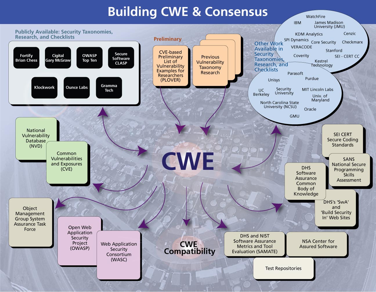
If it helps, there is a single diagram that charts the entire thing: https://cwe.mitre.org/about/images/lg_consensus.jpg
If you can figure it out, let me know :)
I agree, which is disappointing. MITRE has an interesting history, and they've done a lot of very advanced technical work since the 1950s.
and yet, this posting got enough up votes to reach the front page.
I'm sure the site contains a lot of useful data but the presentation is so ugly that it's hard to get motivated to dig in deeper.
Compare it to this, for example: